
staying home: art worth staying home for
A Virtual Exhibit of Daily Posts ~ April 2nd through May 2nd, 2020
Are you staying at home? In these extraordinary and exceedingly difficult times of “social distancing”, “quarantining”, “shelter in place”, “curfews”, and “closures”, each of us is looking for a way to center ourselves - to remind ourselves of what is important - to help ourselves to look on the brighter side of things. Is it possible to stay informed and react to a crisis seriously while maintaining an inner sense of calm and hope? Our response is yes, and we hope this virtual exhibition “Staying Home” can help.
This “virtual” exhibit is a collection of curated works from our inventory that provide an opportunity for a deep dive. Some artworks are calming while others are exciting and active, some are small while others are large, some appear simple at first glance while others appear complex – yet all have much to reveal if you take time to look. Every day for the duration of the exhibit we will post a new work of art to the exhibits page on our website for your enjoyment. Bookmark this page and come back for more art every day.
We will include full photos, detail photos, and a little context about the art or the artist to help you really study the works.
We hope checking this page and spending time with the art becomes a part of your daily routine while you are staying at home; a way to help you release the anxiety and stress. We hope this exhibit gives you a place of retreat and helps relax and uplift your spirit.
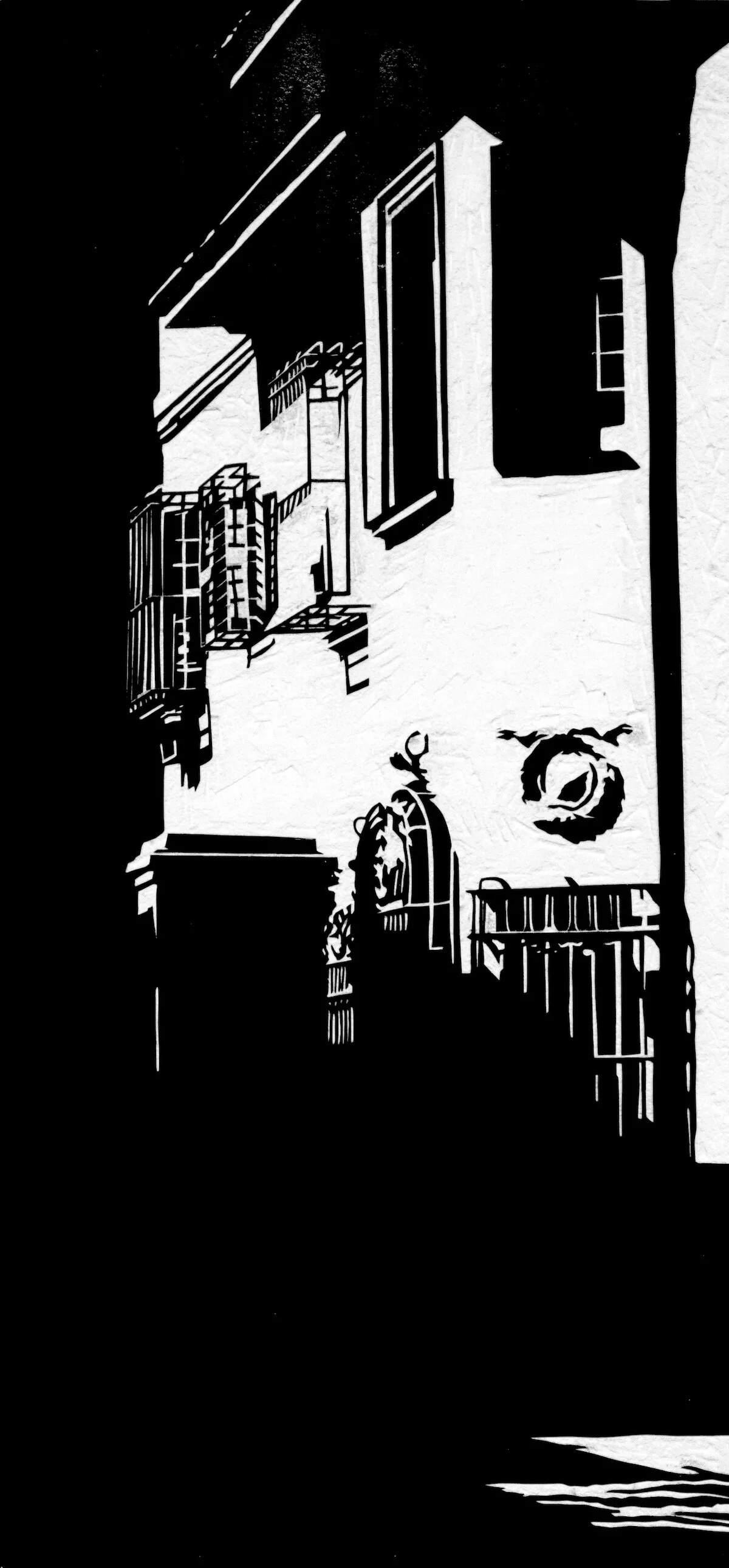
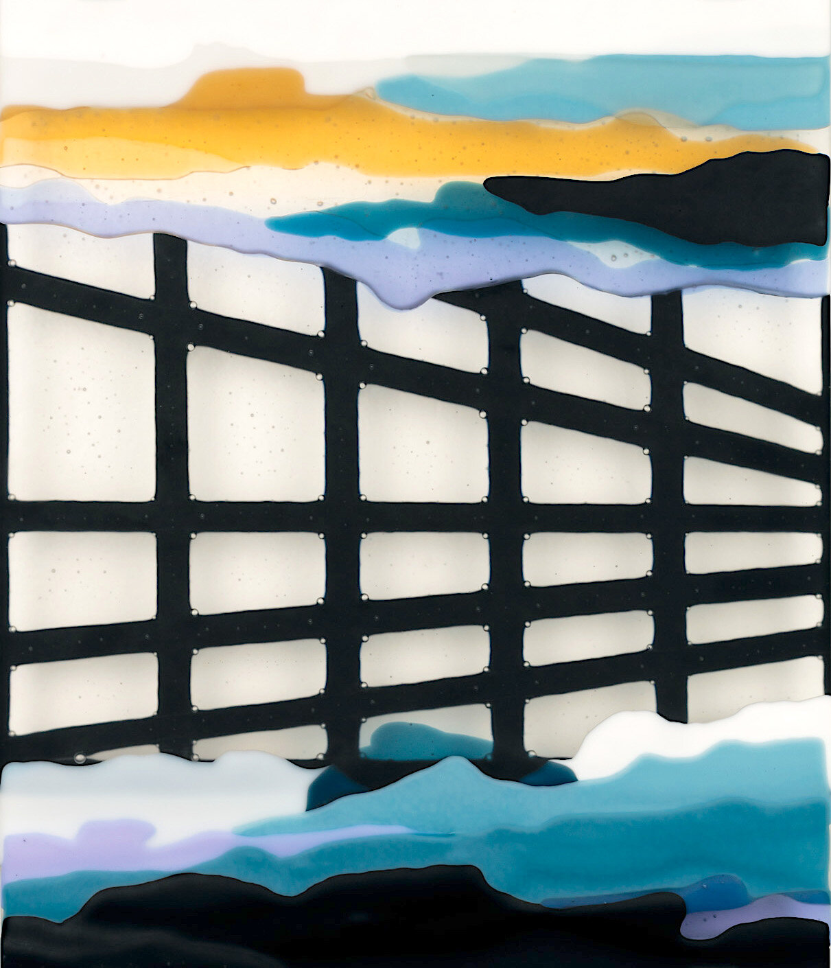
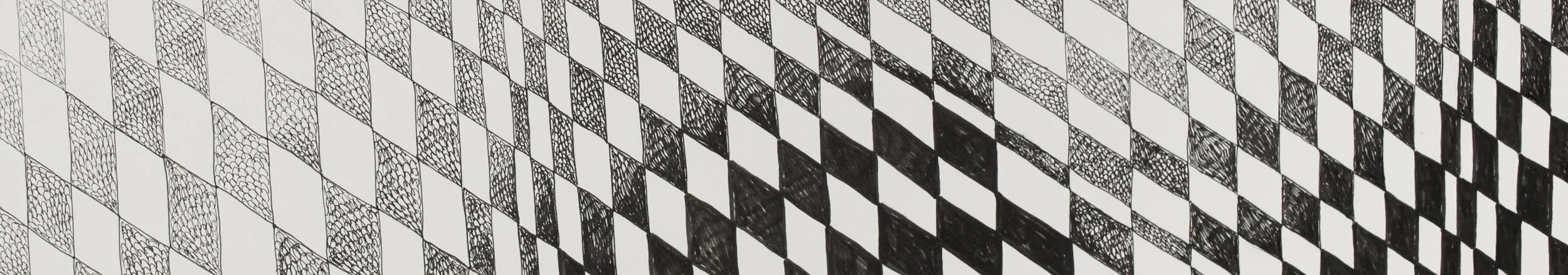
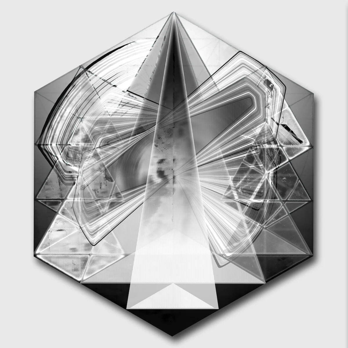
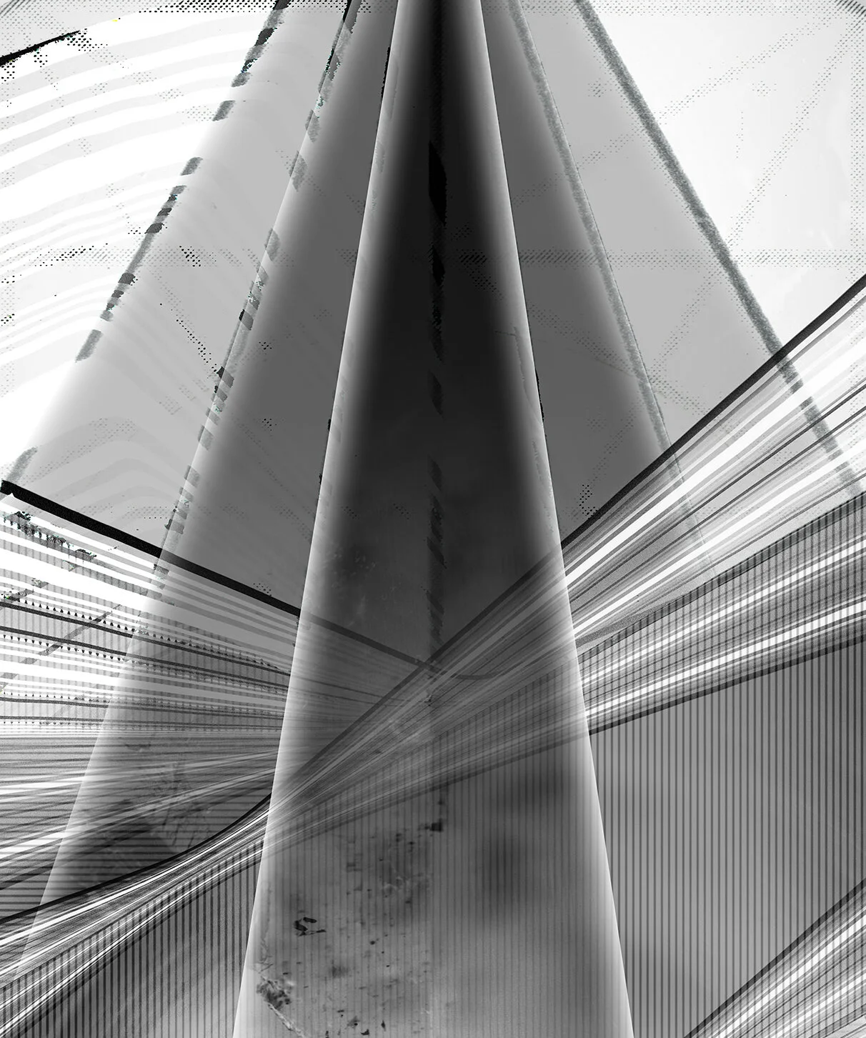
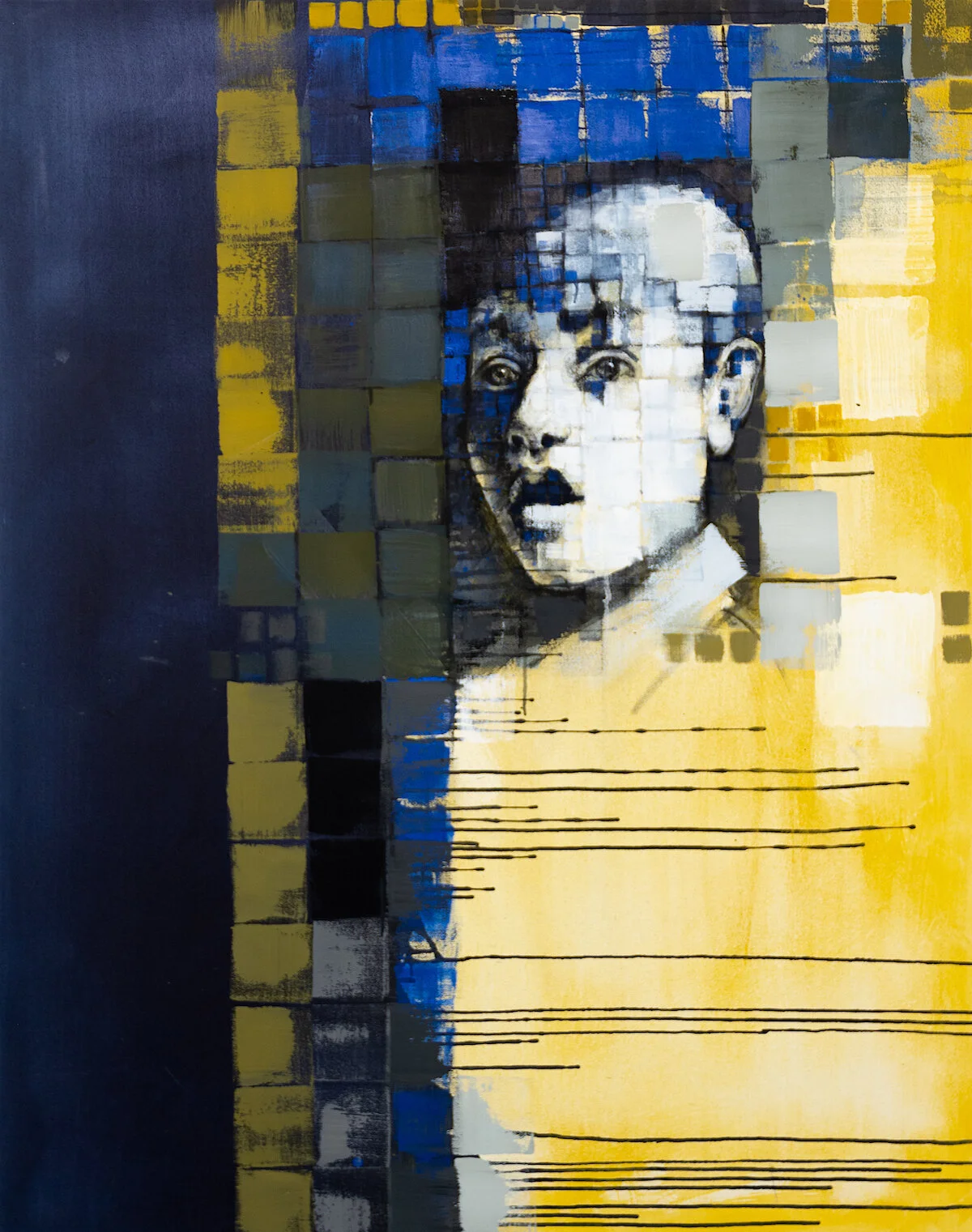
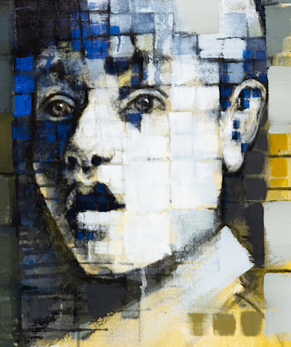
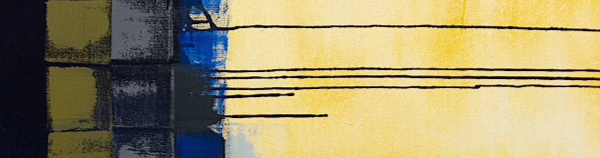
Day thirty-One: May 02, 2020 ~ facade
Artwork details:
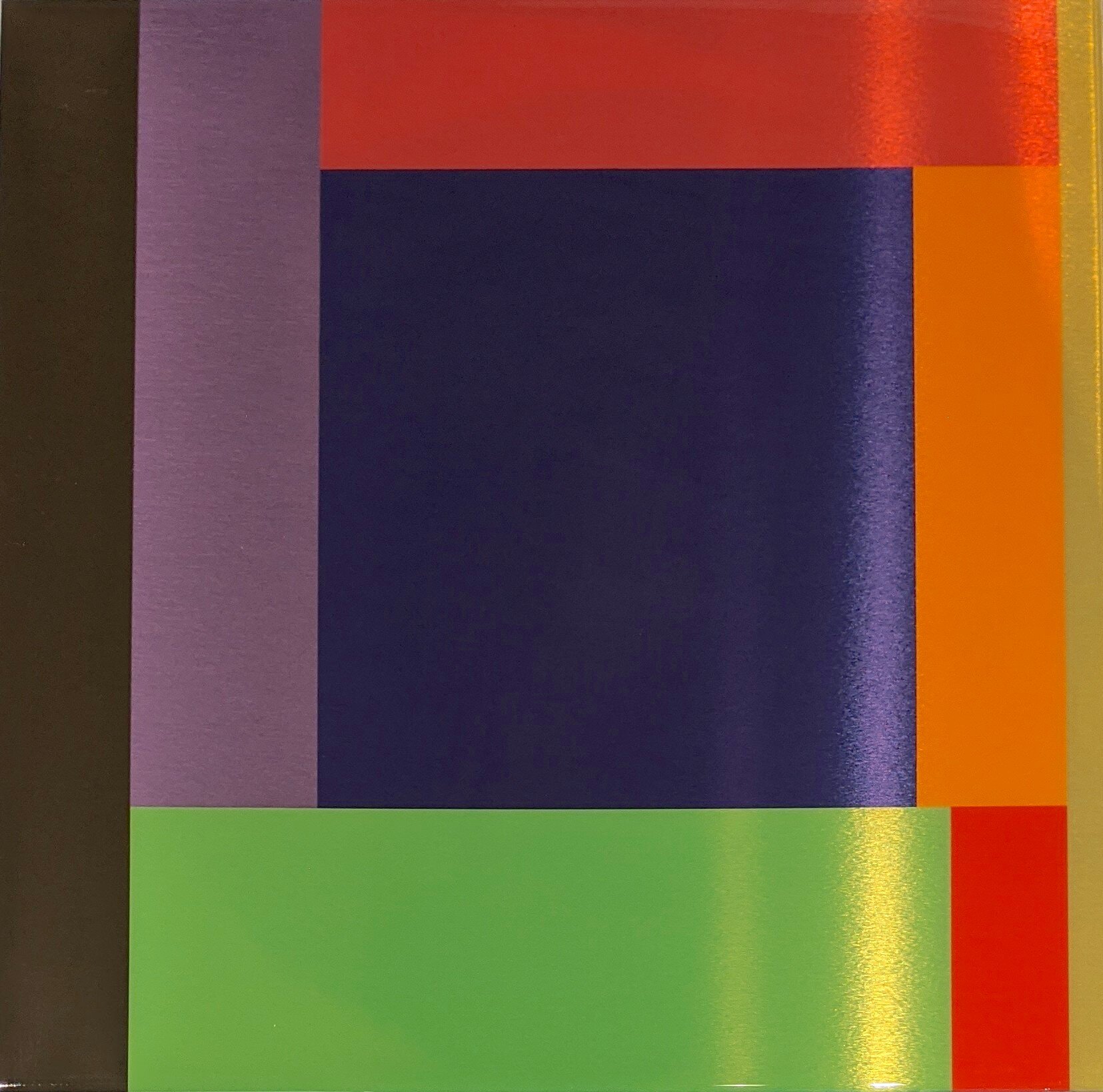
Artwork Title: untitled (Espacios Simultaneous series)
Artist: Daniel Rodríguez Collazo
Date: 2019
Dimensions: 24 3/4” x 12 3/4”
Medium: Acrylic on carved drywall
Price: SOLD

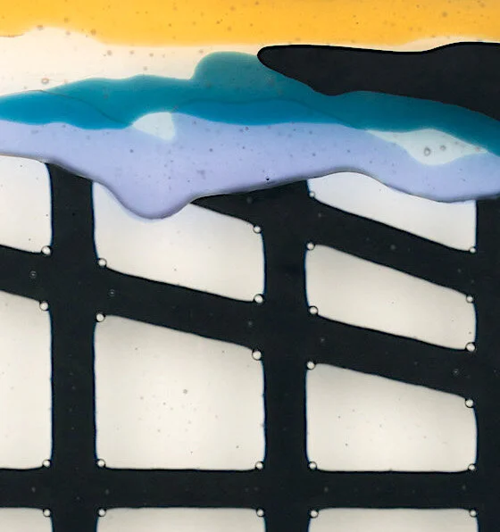
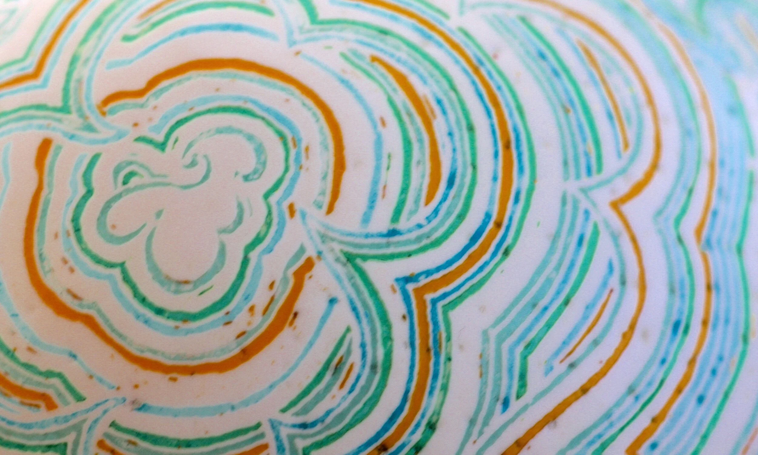
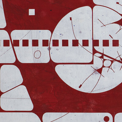
Detail view of Daniel Rodríguez Collazo’s untitled work.
There are several reasons to end the Staying Home exhibit with this artwork by emerging Cuban artist Daniel Rodríguez Collazo.
First, Daniel was scheduled to have a solo exhibit with CAMIBAart Gallery last month that had to be canceled because we couldn’t get the artworks from Cuba due to the COVID pandemic.
Second, we do have enough artworks to be able to feature Daniel’s work in a two-person show. This will be our next show - scheduled to open on May 15th – so ending with Daniel’s work here is a nice teaser for the next show.
Third, ending with an artwork that depicts a facade, a view of someone else’s home from the outside, seemes appropriate for an exhibition created to be viewed while “locked up” inside our own homes.
Daniel creates works using two main processes.
One is using graphite and charcoal on canvas to render “drawings”. This is the process that is used for the works we will show in our next exhibit.
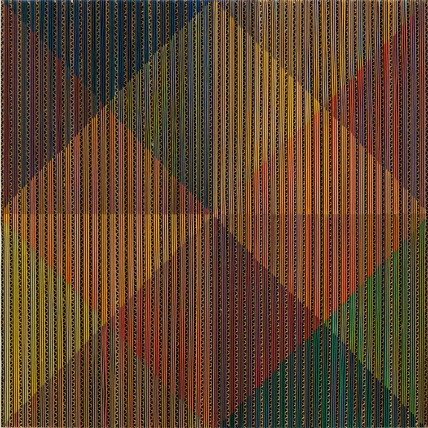
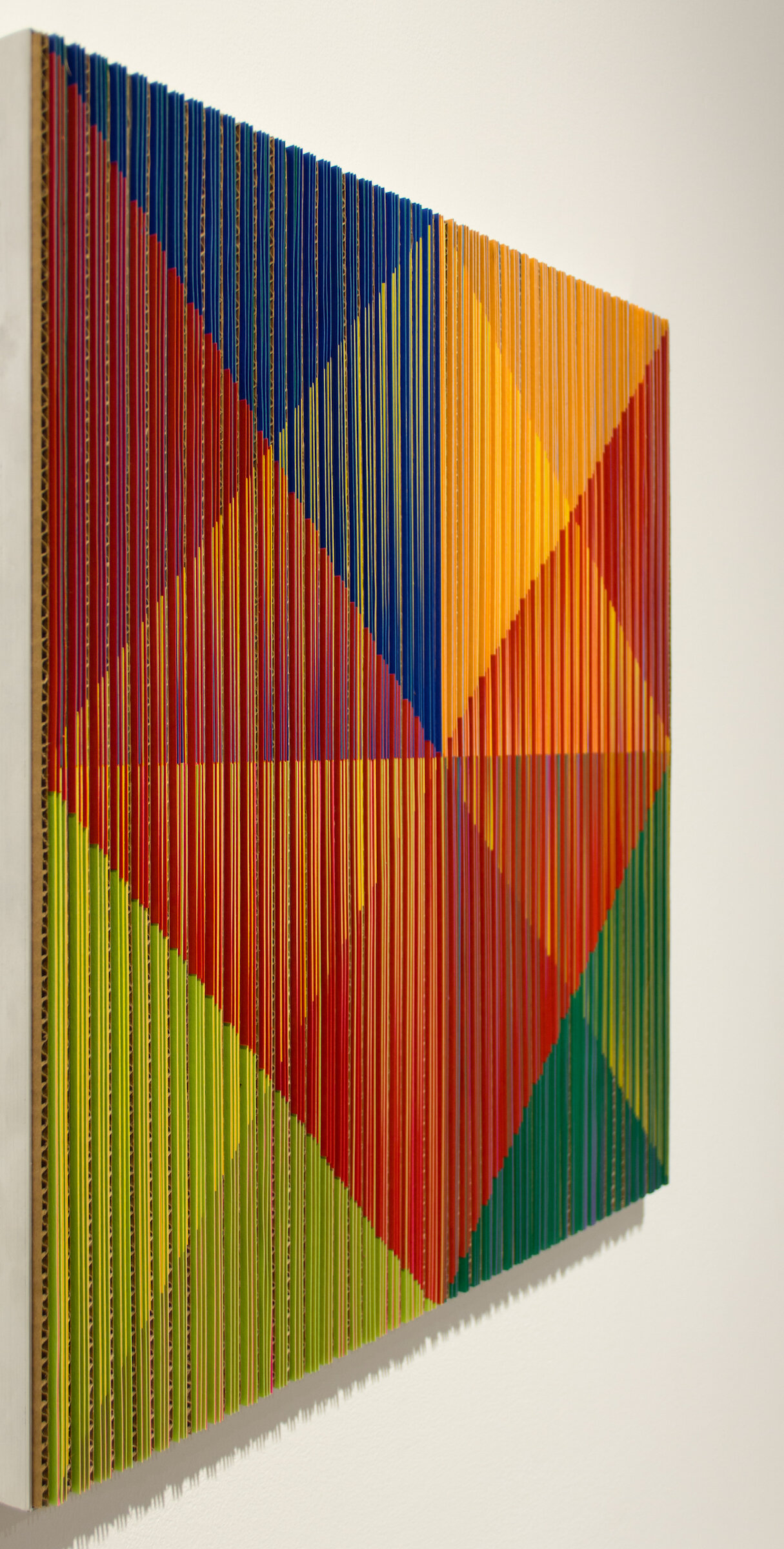
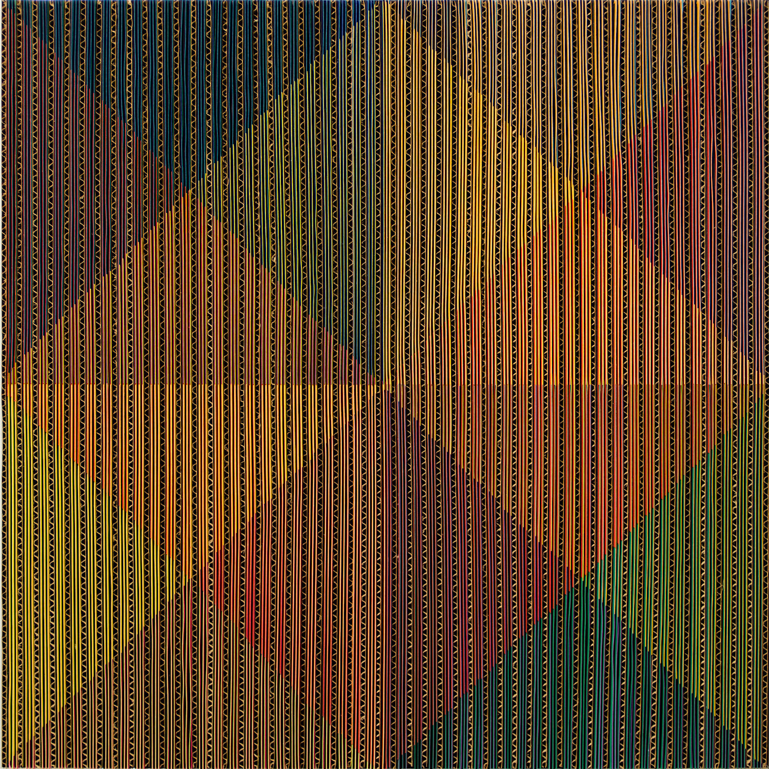
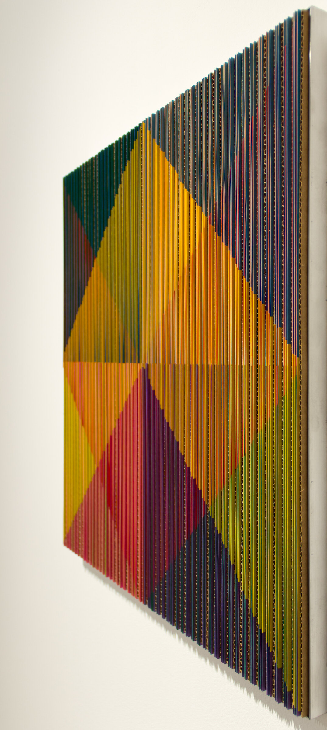
The second process is what he has used to create the artwork featured here. In this process, he starts with a sheet of Drywall (yes, the material that the inside of most of our homes are constructed with), he paints the surface with acrylic, and then painstakingly hand carves the painted surface away to reveal the material below. A sort of reverse mark-making.
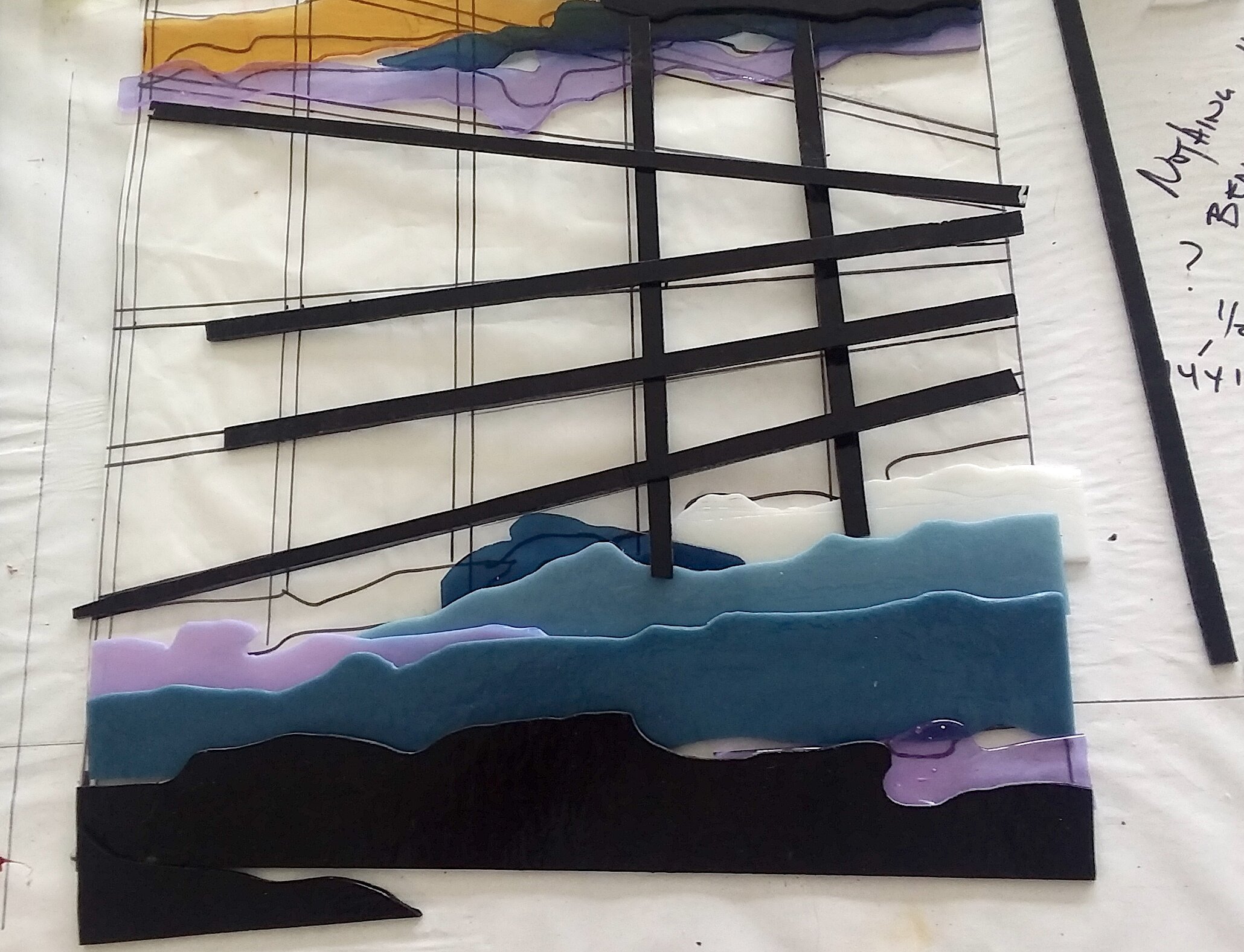
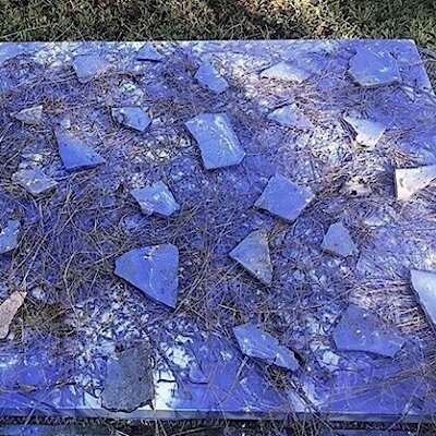
Daniel is fearless in his inquisitive investigation and deconstruction of architectural and formal spaces. This particular artwork was a part of a larger installation titled “Espacios Simultaneous” or Simultaneous Spaces in which he explored the colonial architecture of Havana, breaking it down into incomplete pieces in an attempt to reveal the secrets of the house.
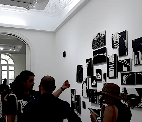
Installation view of Espacios Simultaneous by Daniel Rodríguez Collazo.
Since we will be discussing Daniel’s artwork and background more in depth during the next exhibit, we’ll leave you here with this simple overview:
Daniel Rodríguez Collazo studied in Havana Cuba at the Eduardo Abela Academy of Plastic Arts, with an emphasis on Engraving. His artwork has been featured in solo and group exhibits in many galleries and venues around the world including: Lima, Peru; Madrid, Spain; Berlin, Germany; Turin, Italy; Miami, Florida; New York, New York; Los Angeles, California; Austin, Texas; and of course his home of Havana, Cuba. Among his many recognitions, he as been awarded First Place at Arte Sur Batabanó in Mayabeque Cuba in 2012 and the Drawing Prize from Salón Playa in Havana Cuba in 2013.

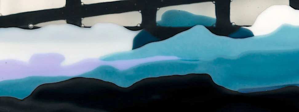
Detail view of Daniel Rodríguez Collazo’s untitled work.
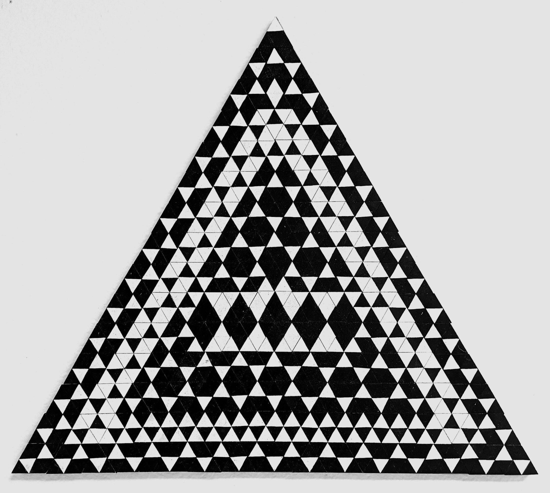
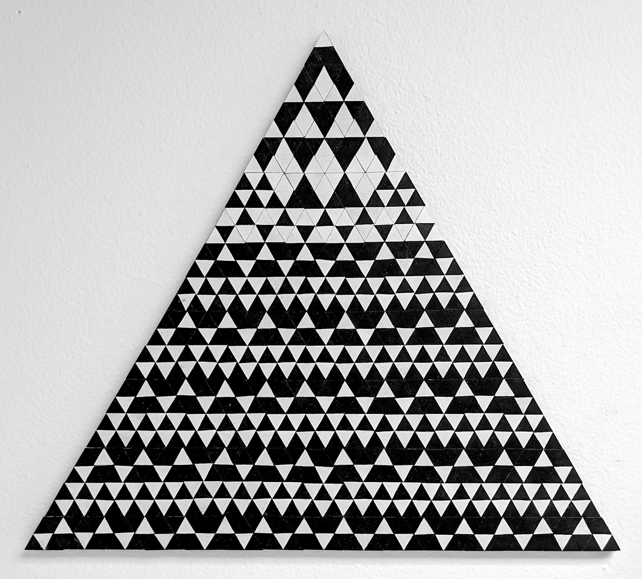
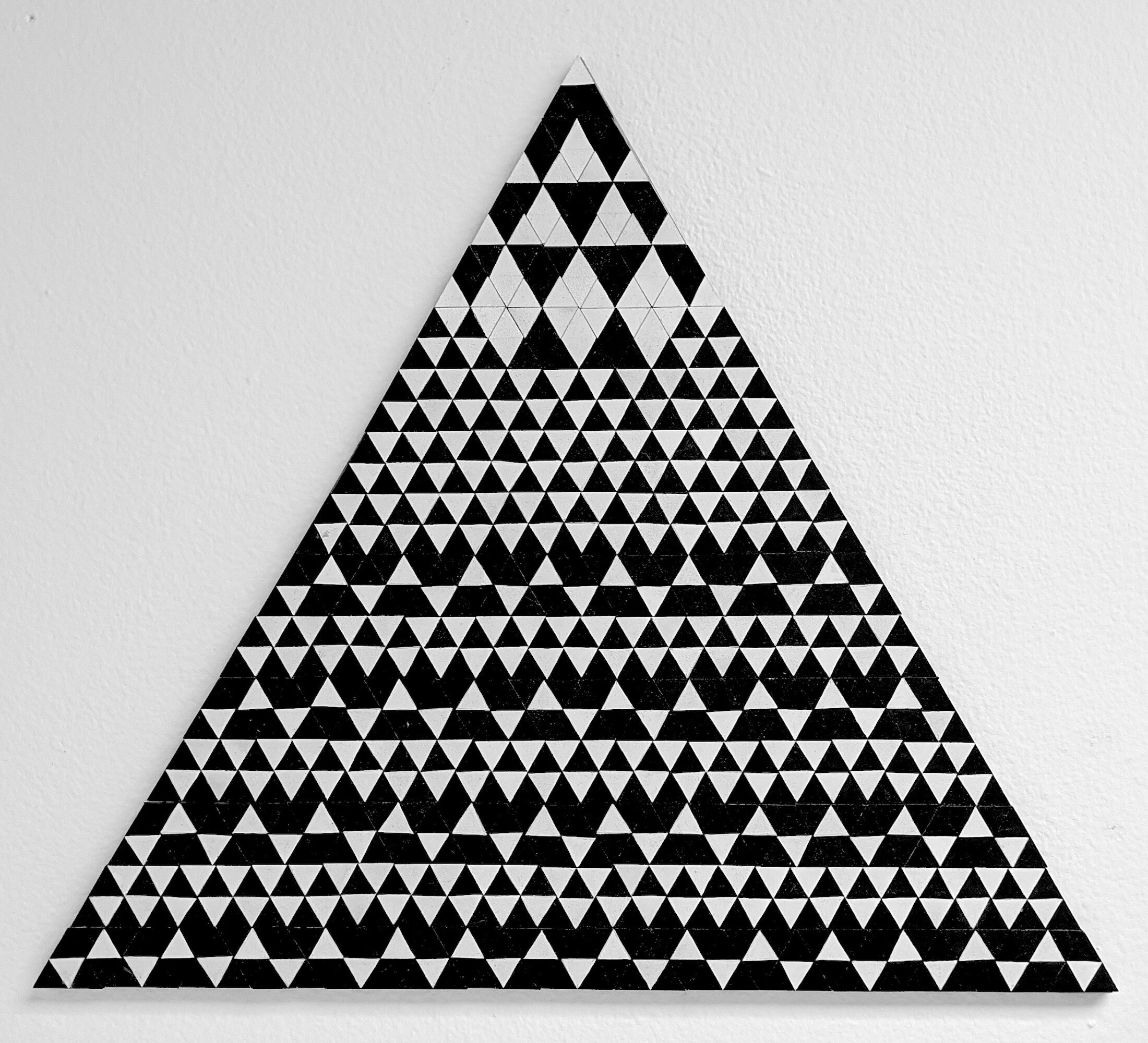
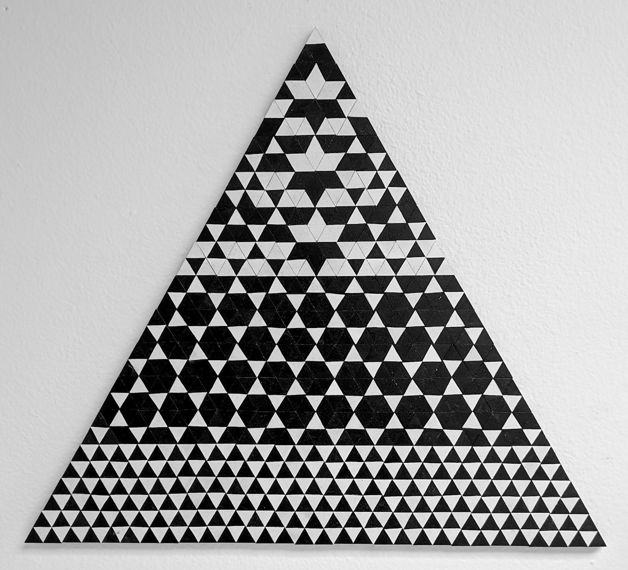
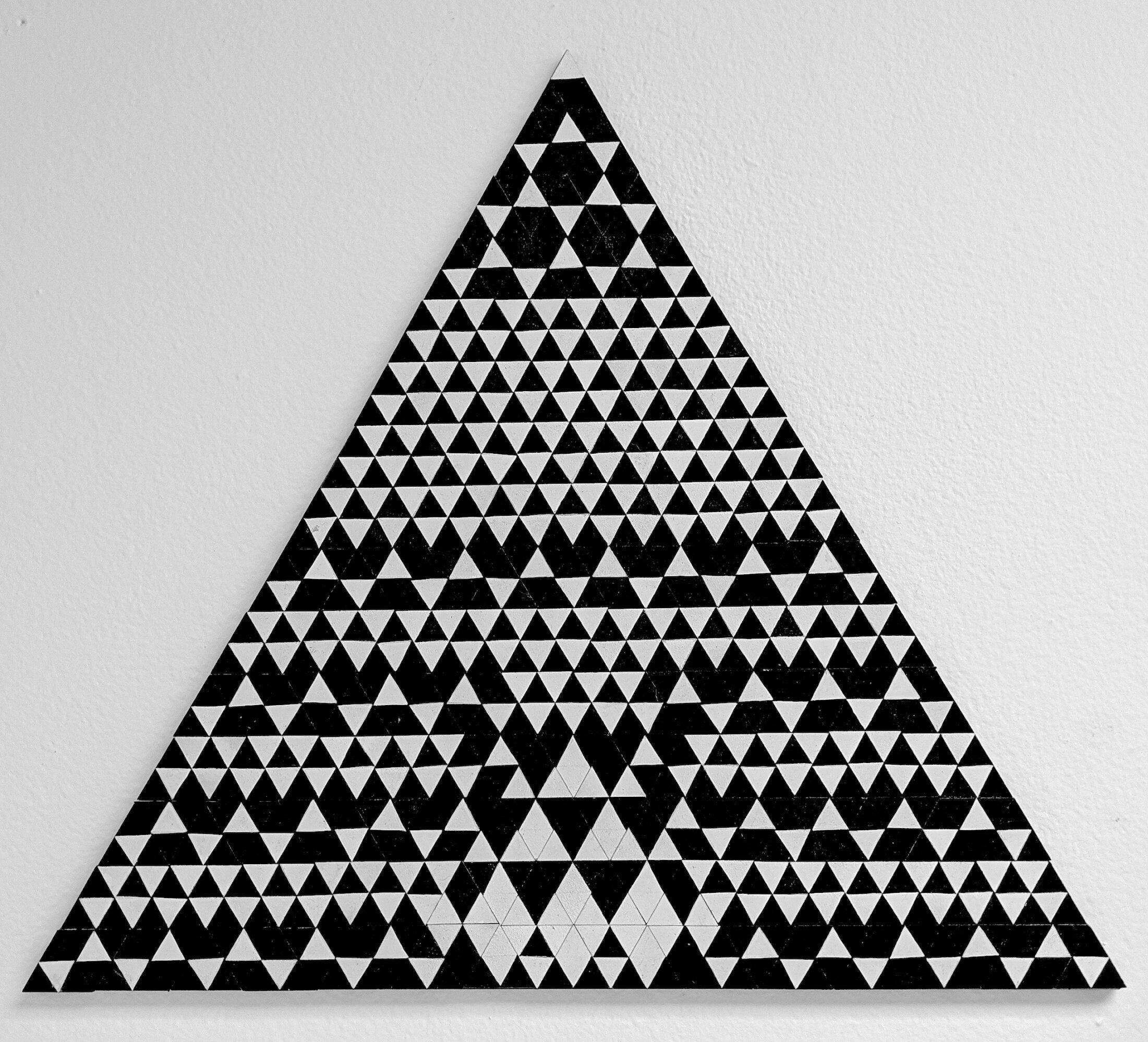
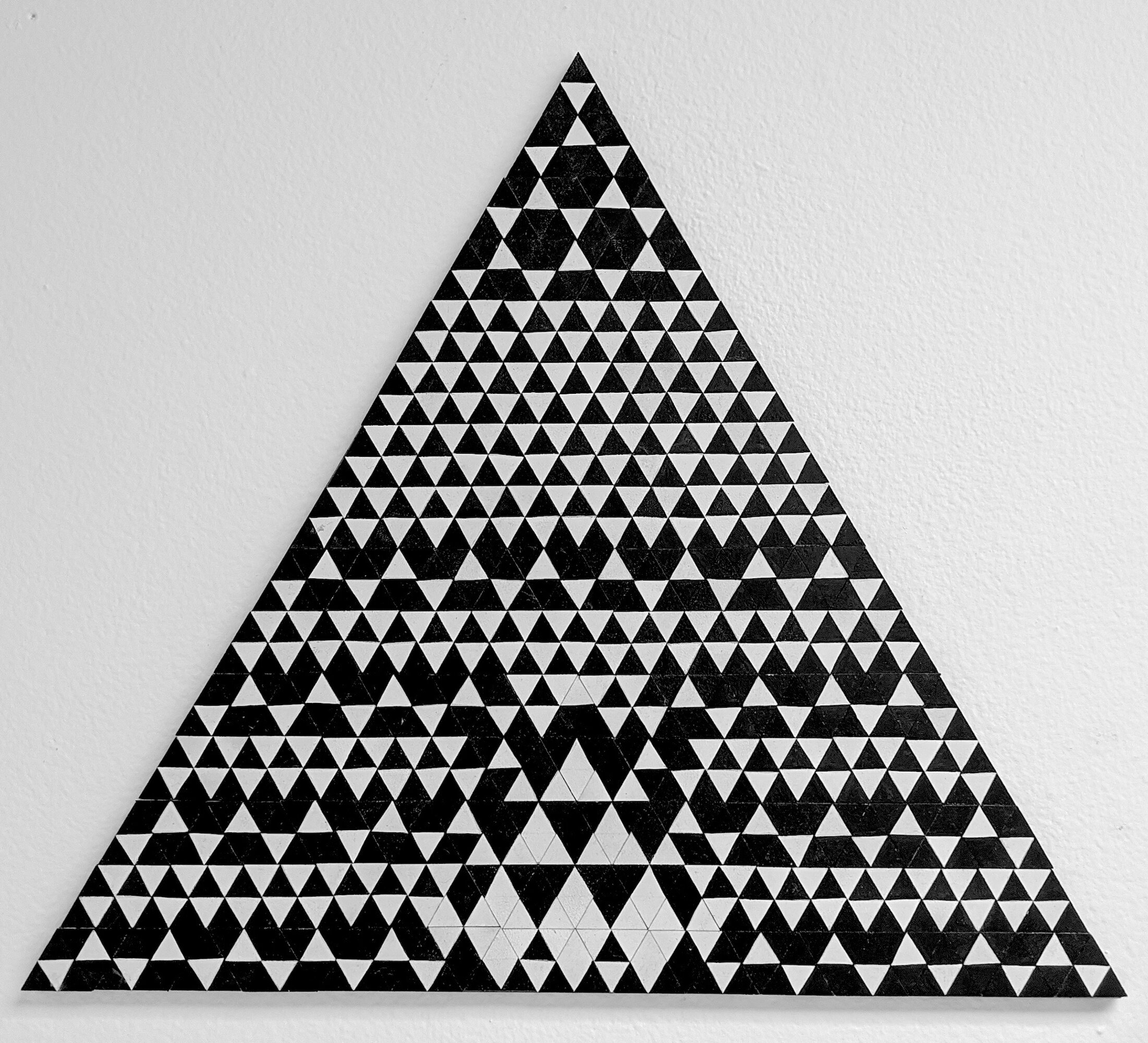
Day thirty: May 01, 2020 ~ puzzling Optics

Artwork details:
Artwork Title: B&W
Artist: Sandra Slim Ortiz
Date: 2017
Dimensions: 15.25” x 18”
Medium: Pigment on MDF with Gesso, Schellac, magnets and metal plate
Price: $650.00 (click to purchase)

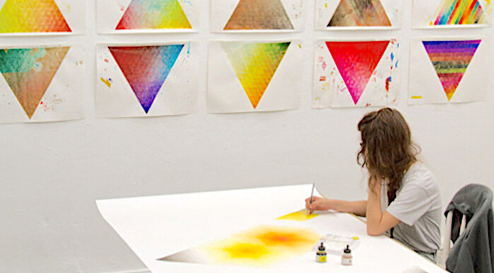
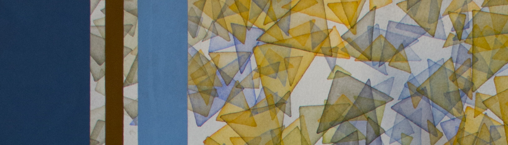
One of the 225 hand painted small triangle pieces that make up the artwork “B&W”.
Sandra Slim began The Triangle Project while living in Berlin; it is about a never-ending modular painting consisting of tiny hand painted magnetic triangles. She creates these tiny triangles combining the high tech production process of computer laser cutting machines with traditional, almost folk-art like, painting techniques. She uses a wide variety of painting & drawing materials including watercolor, shellac, egg tempera, graphite, gold leaf, silver leaf, glitter and more.
This interactive triangular artwork is comprised of 225 smaller triangle MDF pieces. Each piece is hand painted,, usually with patterns and designs. In “B&W” there are five different patterns painted on the small triangles. There are almost limitless patterns that can be created by moving the pieces around. Here we are showing six variations that we have created using the pieces of “B&W”. Yes, Sandra wants the view to manipulate her art by moving the triangles around!
About the artist:
Sandra Slim was born in Mexico City and spend the majority of her childhood there until she was 16 at which time she started traveling to Germany frequently. While spending time in Hamburg, she began learning German and making a social network consisting of mostly artists and musicians. In 2008 Sandra began to study Illustration but realized that wasn’t the career path for her. She then switched gears and was accepted into the prestigious Hamburg Art School.

Gallery Director Troy Campa with artist Sandra Slim Ortiz and the artwork “B&W”.
After completing school, Sandra moved to Berlin Germany. Under the influence of her mentor Michael Conrads, and as well as her collaborator Tim Schrôder, she developed her own personal style of painting based on patterns and naïve figuration. Her formal approach to contemporary painting is based on her classical education.
In Sandra Slim’s artwork you can see a range of influences from modernist abstraction and Kandinksy’s approach to form, shape and color, to Op Art and Neo Geo’s analytical and physiological approach toward painting. Other influences in her artistic practice include: indigenous culture, Paul Klee, Bridget Riley, and Josef & Anni Albers.
Studio view of Sandra Slim at work.

Angled detail of Sandra Slim’s “B&W”.
Day twenty-nine: APRIL 30, 2020 ~ pathway

Artwork details:
Artwork Title: Destination
Artist: Richard Cole
Date: 2019
Dimensions: 60” x 60”
Medium: Oil on panel
Price: $4,900.00 (click to purchase)

Detail of “Destination” by Richard Cole.
Today’s posted artwork needs very few words and a lot of space.
The only thing to note is, when looking at these images, think of the scale of this artwork - it is 5 feet tall and 5 feet wide - you feel like you can step into it when standing in front of it.
On day seven of this exhibit we also featured an artwork by Richard Cole. In that post we explored Richard’s background and his thoughts on his art. For those wanting to read more words, you might look there. But here is something we didn’t post before:
In the artist’s own words:
In “Man Carrying Thing”, Wallace Stevens wrote,
”The poem must resist the intelligence/Almost successfully,”
and I’ve always been attracted to how a painting can define boundaries that it cheerfully oversteps, the way a poem suggests a paraphrase that never fully exhausts the meaning of even the simplest metaphor. I look for gradient understandings, a contemplative reach built on logic but never confined to logical statements. I think that any successful painting has an inner life, with thoughts left unspoken even though their depth and weight feels obvious to the viewer.
~ Richard Cole

Detail of “Destination” by Richard Cole.
Day twenty-eight: APRIL 29, 2020 ~ intuition
Artwork details:
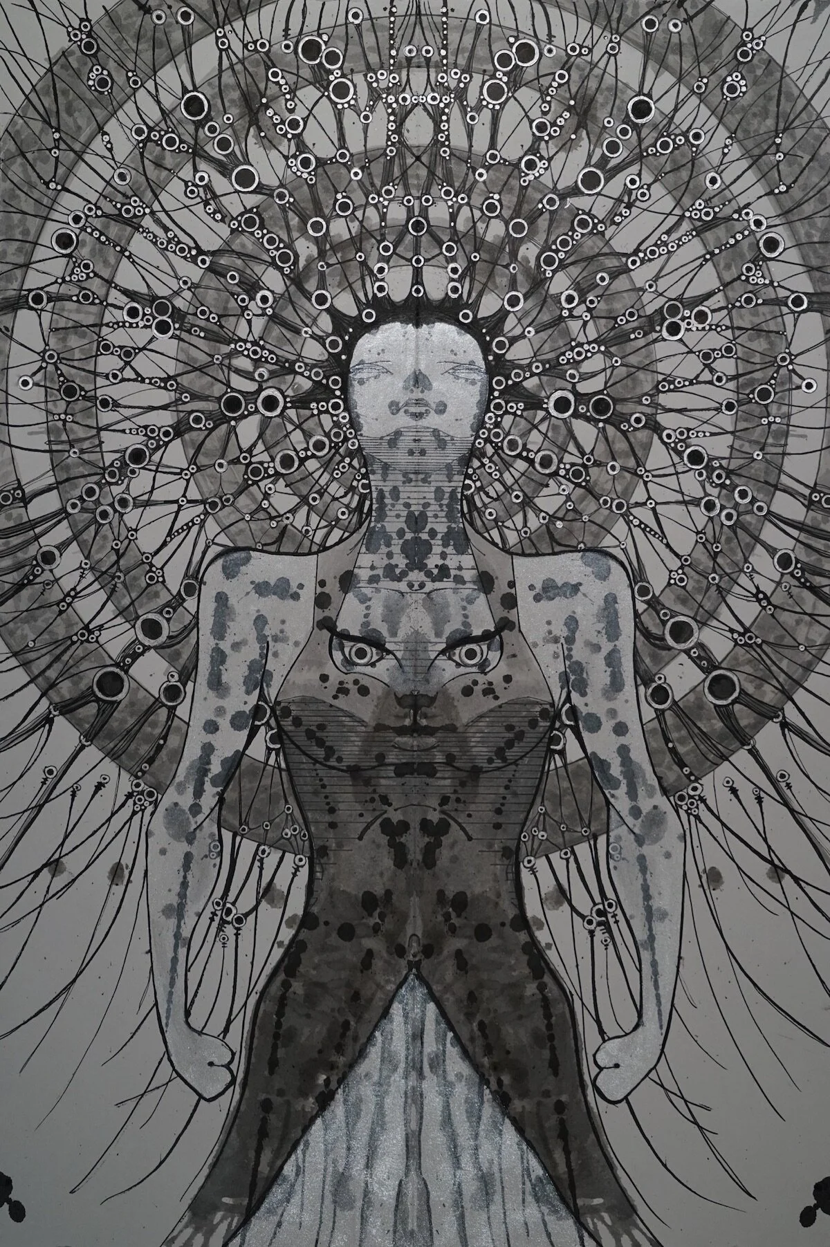
Artwork Title: Mother Matrix
Artist: Matthew Gantt
Date: 2019
Dimensions: 31.25” x 32.75” framed
Medium: Sumi Ink & Acrylic Ink on cotton paper
Price: $1,100.00 (click to purchase)

Detail of “Mother Matrix” by Matthew Gantt.
About the Process:
Matthew Gantt’s artwork is equal parts process and imagination. His signature style is rendered by starting out randomly throw ink onto folded paper and blot it repeatedly until he spontaneously see an image; similar to making of the Rorschach Test ink blot. Matthew then enhance that image by connecting the dots, painting, and line work to ensure that others see what his mind first saw in the chaos.
About the Artist:
Matthew Gantt is a graduate of the Seattle Film Institute and a visual artist who has worked in various mediums ranging from film to sculpture to ink drawing. In 1996, he developed a technique of rendering mythopoeic images from the collective unconscious called Constellationism. He is a decorated U.S. Army veteran, an Associate of the Joseph Campbell Foundation, a member of the Jung Center of Houston, and a member of the Houston Zen Center.
He currently resides in the diverse city of Houston, where he keeps a studio at Silver Street Studios. When he is not making art or meditating, he can usually be found in his favorite armchair reading or in the kitchen cooking Japanese food for his wife and son.

Detail of “Mother Matrix” by Matthew Gantt.
In the artist’s own words:
My efforts result in dreamlike, archetypal portraiture that blurs the lines between art, depth psychology, and shamanism. Because the subject matter is not predetermined, I am always surprised and intrigued by what emerges; creating a piece always provides an opportunity for self-exploration.
Whereas ancient civilizations found forms in the night sky and attributed their gods and heroes to them, I create constellations using the stars that occupy my own, inner firmament and identify the heroes, demons, and other characters of my unconscious.
What I find are these curious and delicate figures, like fossilized dreams, and I share them with you.
~ Matthew Gantt

Detail of “Mother Matrix” by Matthew Gantt.
Day twenty-seven: APRIL 28, 2020 ~ monumental

Artwork details:
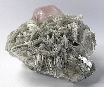
Artwork Title: Sunder 2
Artist: Rebecca Rothfus Harrell
Date: 2018
Dimensions: 24” x 36”
Medium: Graphite, gouache, vinyl paint, and paper on panel
Price: $1,950.00 (click to purchase)
In the artist’s own words:
I utilize mineral structures as the primary source imagery in my work. When examined closely, the crystalline structures appear to be miniature worlds; an uncharted terrain, ancient archeological site or pioneering architecture. I am intrigued by the variations in form, color and complexity that make naturally occurring formations feel as though they are engineered objects. Through formal choices I redefine what that source structure is, allowing it to bounce back and forth between the natural and the manmade.
~ Rebecca Rothfus Harrell

“Sunder 2” installed with other artworks by Rebecca Rothfus Harrell and William T. Carson in the exhibition “Source Material”.
The forms in Sunder 2 are specifically inspired by Muscovite, a type of Mica.
This artwork was created for “Source Material”, a collaborative two-person exhibit held in 2018 with William T. Carson in which both artist used Mica and Coal as the source for their artworks.
An Abbreviated Bio:
Rebecca Rothfus Harrell earned a BFA from The School of the Art Institute of Chicago, and a Master of Arts in Teaching from The School of the Museum of Fine Arts/Tufts University.
She has completed several residencies including at The Banff Center in Alberta, Canada in 2015 and The Helene Wurlitzer Foundation in Taos, New Mexico in 2019.
Her art has been exhibited around the country, including in: San Jose, CA; Telluride, CO; Miami, FL; Chicago, IL; Columbus, OH; Philadelphia, PA; Dallas, TX; Marfa, TX; and Austin, TX.
Additionally, in 2018 Rebecca was commissioned by Kendra Scott to create custom artwork for the launch of her candle collection, and also in 2018, Facebook commissioned her to install a mural in their Dallas headquarters.
Living in Austin Texas, Rebecca works as both a full time studio artist and a part time arts educator.

Detail of “Sunder 2” by Rebecca Rothfus Harrell.

Detail of “Sunder 2” by Rebecca Rothfus Harrell.
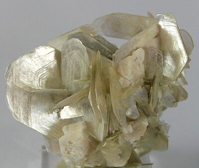
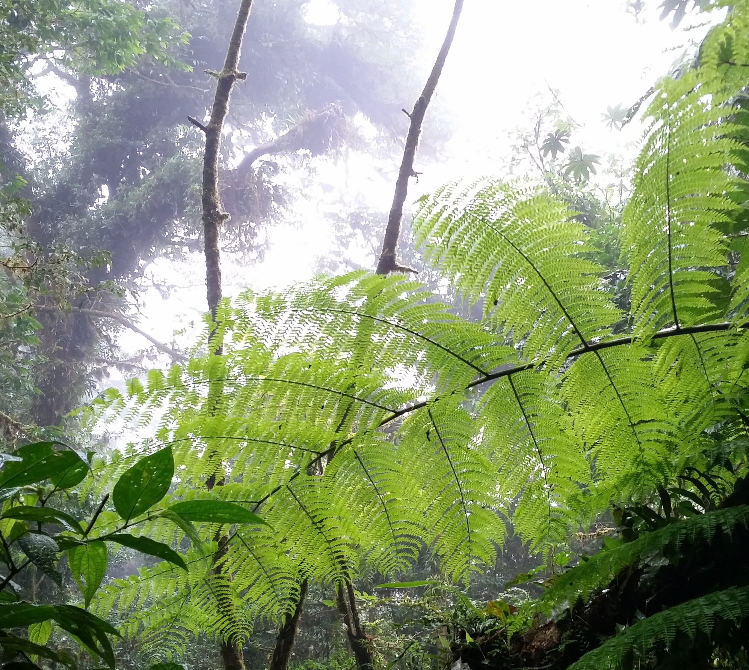
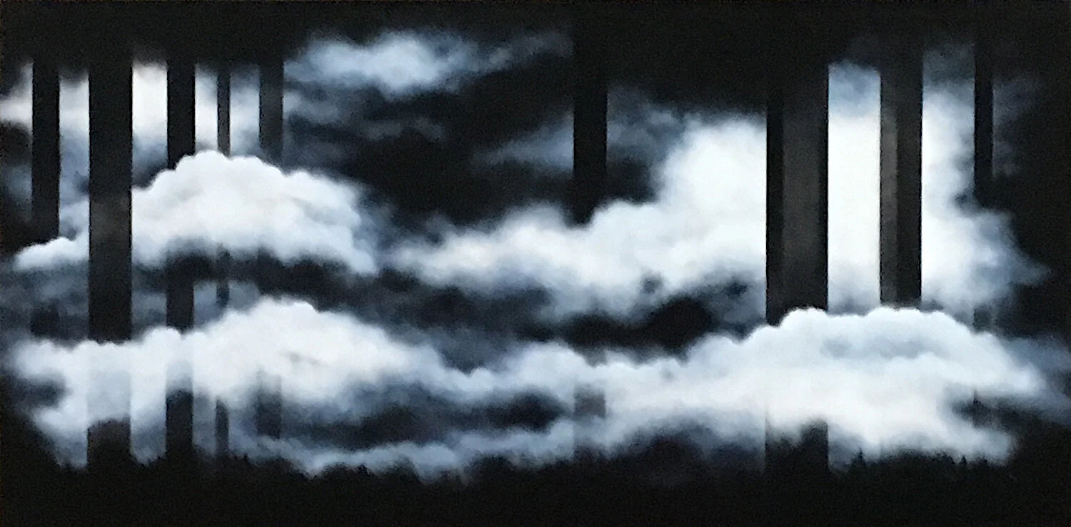
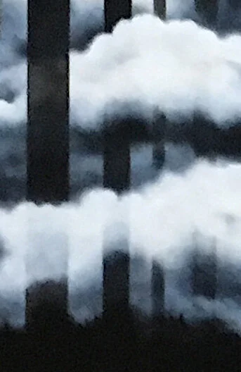
Day twenty-six: APRIL 27, 2020 ~ Rushing not rushed

Artwork details:
Artwork Title: Cloud Forest Lenses 16
Artist: Margaret Smithers-Crump
Date: 2017
Dimensions: 36” Diameter
Medium: Acrylic, oil paint, oil bar, oil pastel, Prismacolor, on translucent recycled Plexiglas
Price: SOLD
The inspiration for the Cloud Forest Lenses series comes from the time Margaret spent in the Costa Rica cloud forests. As she explored the misty forest, peering through the camera lens, Margaret became enamored with the view of the weightless water particles suspended in mid-air, diffusing the plants and landscape around her. This artwork, Cloud Forest Lenses 16, is specifically inspired by her memory of a waterfall she saw on this trip.

In the artist’s own words:
My work focuses on the vulnerability and inter-connectedness of the Earth’s diverse life forms and ecosystems. It explores natural conditions of development such as birth, maturation, procreation and death and unnatural conditions caused by human impact such as global warming, pollution and loss of habitat. Growing up on a tiny island in Canada, I witnessed the transformation of our lake’s crystalline waters changing with obvious signs of pollution.
Later on while living in the South Pacific, I saw clear evidence of invasive species and witnessed the awesome beauty of life in the coral reefs that are now affected by coral bleaching. Profoundly saddened, I developed a passionate regard for the planet and its life forms. As a result, I wanted to find an art material that could conceptually evoke fragility and breakage. I wanted something that looked like glass but offered many creative possibilities.
In the late 90’s I began working with recycled Plexiglas and Polycarbonate and found that these substances perform with amazing versatility.
The acrylic can receive a variety of media that is applied to the front and back of the forms. The painted surfaces are translucent and provide possibilities for greater depth and luminosity. While Plexiglas offers diverse applications for my practice, it also offers compelling conceptual strengths that underscore my core concerns regarding the fragile balance of life on our planet. The glass-like appearance implies the possibility of breakage and shattering. It is a powerful metaphor for the tenuous existence of all life.
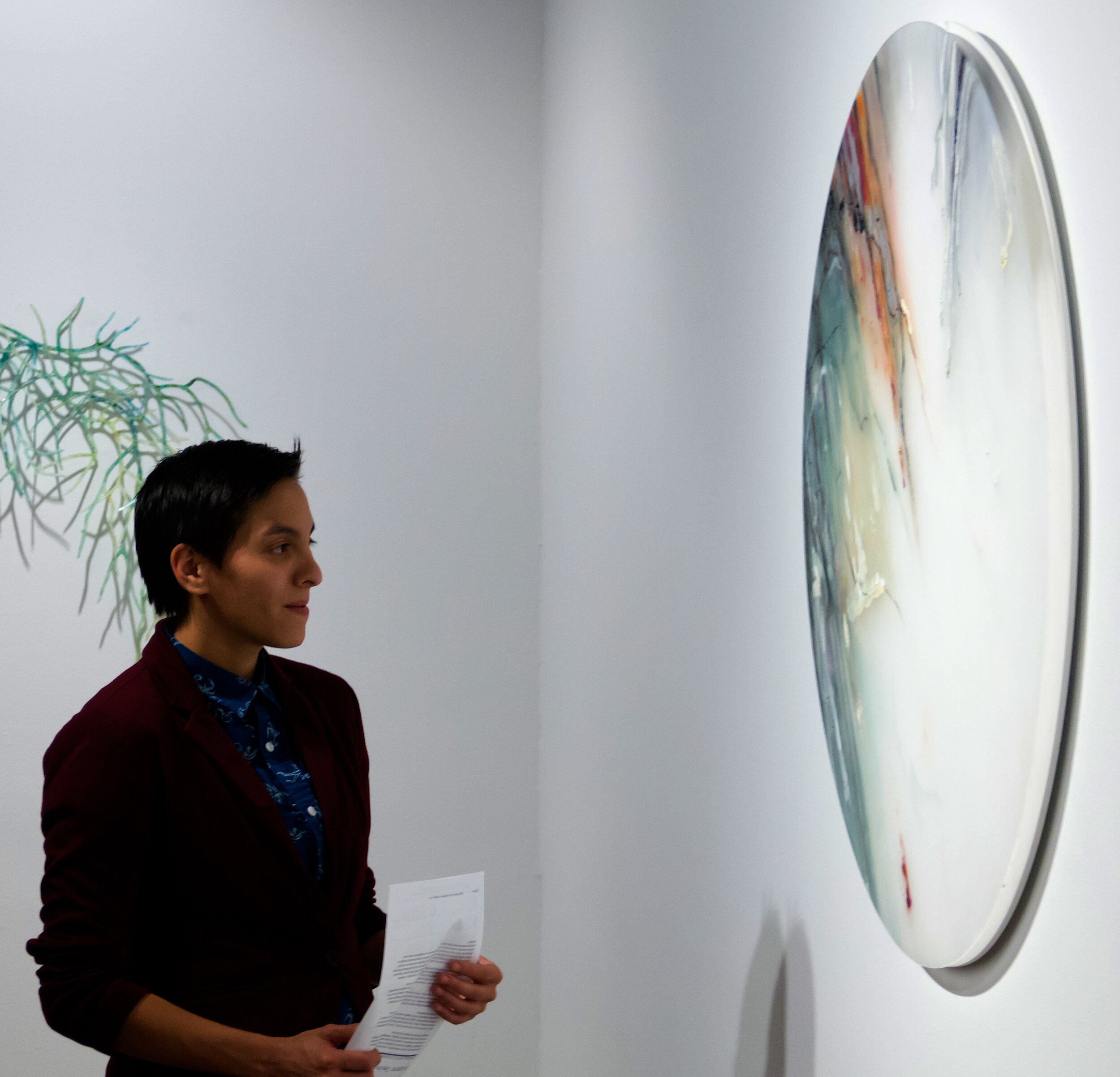
A visitor contemplating Margaret Smithers-Crump’s “Coud Forest Lenses #16” on view.
About the Artist:
Margaret Smithers-Crump is a Canadian artist based in Houston, Texas, with an art career spanning more than 40 years. She received her BFA in Painting from Miami University in Oxford, Ohio. Since then, Margaret has explored the creative potential of Plexiglas and Polycarbonate, in both painting and installations, rendering them so that they take on a natural, organic and living quality. Her artworks are often soft, colorful, and ethereal, intending to bring attention to the vulnerability and inter-connectedness of the Earth’s diverse life forms and ecosystems.
Margaret Smithers-Crump’s artworks have been exhibited extensively around the United States in countless group exhibits and over 30 solo exhibits, including Beeville Art Museum, Beeville, TX; Imperial Center for the Arts and Sciences, Rocky Mount, NC; Pearl Fincher Museum of Fine Arts, Spring, TX; and Penn College of Technology – Penn State, Williamsport, PA.

Detail of Margaret Smithers-Crump’s “Cloud Forest Lenses #16”.
Day twenty-five: APRIL 26, 2020 ~ nature flows

Artwork details:
Artwork Title: Pink Rocks II
Artist: Katy David
Date: 2018
Dimensions: 10” x 10”
Medium: Gouache and Acrylic on Birch panel
Price: $300.00 (click to purchase)
For us, this work feels like rushing mountain riverbed in a surrealist world of hyper color – we can even hear the garbling of the twisting water – so charged with energy and peacefulness at the same time. But that is us - how does it make you feel?
A native of Austin, Katy David first established a following with her uniquely modern presentation of a centuries-old technique called Pysanky. In this batik process she uses beeswax, a small heated funnel, and aniline dyes to create intricately layered patterns of color, geometry and two- dimensional lines on three-dimensional eggshells. On day 13 of this exhibit we featured one of these artworks.

Detail of Katy David’s “Pink Rocks II”

A QUICK LOOK AT THE PROCESS ~ Katy David in a post on Instagram: "I find outlining to be so satisfying."
Over the last few years she has incorporated new mediums and methods into her artistic practice, now creating fired ceramics and gouache paintings. Even though these two new mediums diverge visually from her earlier work, a closer look reveals her continued fascination with line, pattern, and movement. Pink Rocks II exemplifies the artistic direction she is exploring with her gouache paintings.
It has been wonderful watching her take the opportunity to increase the scale of her works - working on large wood panels - a scale that the eggshells never allowed. We look forward to presenting some of her newest works soon!

Detail of the panel edge of Katy David’s “Pink Rocks II”
Day twenty-four: APRIL 25, 2020 ~ Musical structure

Artwork details:
Artwork Title: Hymn to Color #17 (2 or 5)
Artist: Michel Muylle
Date: 2013
Dimensions: 22” x 22”
Medium: UV ink on aluminum
Price: $900.00 (click to purchase)
““Hymn to Color” reflects my innate love for music. Ranging from the classical greats such as Mozart and Verdi to the flavors of today, this accompaniment reflects upon color and feelings. ”

Artist Michel Muylle with some of his scarf designs.
A native from Belgium, Michel was raised in the medieval city of Bruges, where he was surrounded by art throughout his rearing. From very early on, he had taken a keen interest in contemporary and abstract art, surrounding himself with a company of peers within the visual arts community.
After studying as an engineer and obtaining a management degree, he joined a large multinational oil and gas company and started a career in engineering, process design, project management and strategic planning. This chapter in his life took him through various countries in Europe, Latin America, Asia, Africa, and to the United States, where he now resides in a tucked away neighborhood of metropolitan Houston.
Years of extensive traveling throughout his career broadened his passion as an avid collector of contemporary art. In a natural shift of curiosity, he started exploring his own artistic interests in drawing and painting. After many years of implementation in this discipline, he complemented his own experimentation with various media such as pastels, charcoals, acrylics and oils.
Some of his earlier works consist of monochromatic abstract paintings, which reflect a near maniacal and meditative approach to applying oil paint on canvas. Earlier works also included variations on geometric abstraction with a strong focus on the interplay of color abstract expressionism.
True to his never ending need of dialogue within the visual arts, in 2012, Muylle produced “Collector’s Waltz”, a documentary film reflecting upon the passion of collecting art and the relationship with artists. The film was awarded a Gold REMI at the 2012 Houston WorldFest International Film Festival.His latest body of work, “Hymn to Color”, is created by means of abstract experimentation of media. The pursuit of pure color blocks confined in fine lines of perfection is perhaps the perfect amalgamation of the accidental engineer turned artist. He now experiments with novel LED lit panels incorporated with a variety of frames.


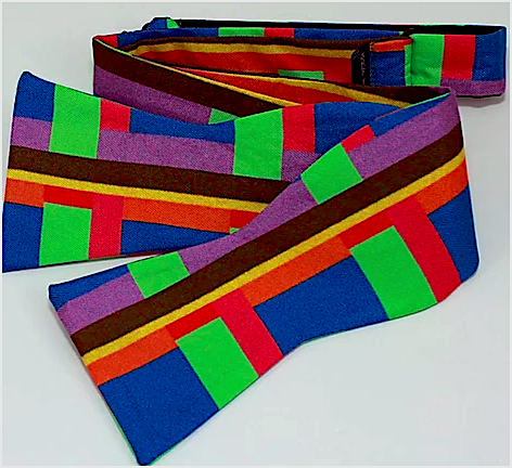
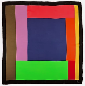
In 2013, he began to apply his art and his design practice to an expanding line of luxury fashion accessories and home-goods including pure silk scarves, pocket squares, bow ties, neckties and pillows.
“As an engineer, I have a passion for technology and novel materials, which is reflected in my use of aluminum, resins and, more recently, state of the art LED panels. This love of modernity does not however restrict my art practice, and I love to juxtapose tradition with innovation.”

Detail of Michel Muylle’s “Hymn to Color #17”
Day twenty-Three: APRIL 24, 2020 ~ comfort

Artwork details:
Artwork Title: Picnic with Atomic Family 3
Artist: Adreon Henry
Date: 2016
Dimensions: 5” x 13”
Medium: Acrylic, Industrial grade vinyl, sealer, canvas
Price: $325.00 (click to purchase)

Detail of Adreon Henry’s “Picnic with Atomic Family 3”.
There is something comforting about picnics; about the thought of gathering family and friends together to dine outside. It could be out in the bright spring sunshine or under the shade of the big oak tree on a cool summer eve. It could be a casual lunch with sandwiches, potato chips and coke or a more upscale romantic picnic for two with pasta salad and a bottle of wine. But whenever you think of picnics, you inevitably think of wicker baskets and red plaid tablecloths or blankets. For us, there is something comforting about this artwork just like a picnic.
All of Adreon Henry’s abstract artwork is process driven, using a variety of screen printing and painting techniques on non-traditional mediums. For “Picnic with Atomic Family 3”, Adreon started with two pieces of industrial grade vinyl. He created designs on the surface using silk screens and brushes to applied inks and acrylic paint. After the two paintings/prints dried, each piece was cut into strips; one piece cut horizontal and the other vertical. They were then woven and attached to a traditional canvas frame before he applied several coats of paint and ink. Again, letting the coats completely dried, he then sanded the surface allowing for textures, base images, and other elements to resurface. Sanding is the pinnacle of production, due to not only its order in the process, but also the range of effects achieved during the process. After sanding was complete, he added a final seal coat to the surface.
Detail of Adreon Henry’s “Picnic with Atomic Family 3”.
Adreon Henry has always been curious about how things are constructed and has always had a drive to create. His current artistic practice is broad in scope and materiality with his creativity being expressed through music, graphic design, video, installation, and merchandise design and production. Adreon is a graduate of the University of Texas with a BS in Creative Advertising. He has had numerous solo and group shows including in France, Germany, Slovakia, California, Florida, New Mexico, and at least seven Texas cities. Adreon’s artwork is part of many corporate collections including Google, Capital One, ONE Medical Group, Charles Schwab, and Dell Children’s Hospital. Adreon currently lives and works in Austin Texas.

Detail of Adreon Henry’s “Picnic with Atomic Family 3”.
Day twenty-Two: APRIL 23, 2020 ~ vibrant memories

Artwork details:
Artwork Title: Chromolight 16MC8-1
Artist: Lorena Morales
Date: 2018
Dimensions: 16” x 20” x 2”
Medium: Enamel on Plexiglas over aluminum with metal caps
Price: $2,500.00 (click to purchase)
Lorena Morales is known for her work on translucent surfaces, as well as her exploration of memories and the effect time has on them. In the Chromolight series, clear Plexiglas rods are painted with vibrant colors and arranged in various configurations and orientations. As the viewer approaches the works, the color appears and then disappears much like memories. Memories often feel like fragile fleeting things. The simplest smell, sight, sound, or thought can spark a memory, while the lightest wind can blow it out. Lorena is encouraging us to share our memories and give them life, no matter how fractured or fragile they are.

Photo of Lorena Morales at her “Glimmers of Time” exhibit in 2018.
About the artist:
A native of Venezuela, Lorena Morales graduated from Rafael Urdaneta University with a degree in Business Administration before immigrating to the United States and studying at the Glassell School of Art at the Museum of Fine Arts, Houston. In 2011, she was awarded scholarships from The Carlos Cruz-Diez Foundation and the Glassell School to participate in the Advance Seminar in Contemporary Art: The Doors of Perception. Lorena Morales’ artworks have been exhibited in Germany, Venezuela, and throughout the US, including extensively in Texas. Winning many awards and grants, she has also completed numerous public and private commissions. For two years in a row, her works have been selected to be part of a Houston billboard campaign to celebrate Latino artist. This project is organized, juried, and sponsored by Inter-University Program for Latino Research, UH Center for Mexican American Studies, and Clear Channel Outdoor.

Detail of Lorena Morales’ “Chromolight 16MC8-1”.
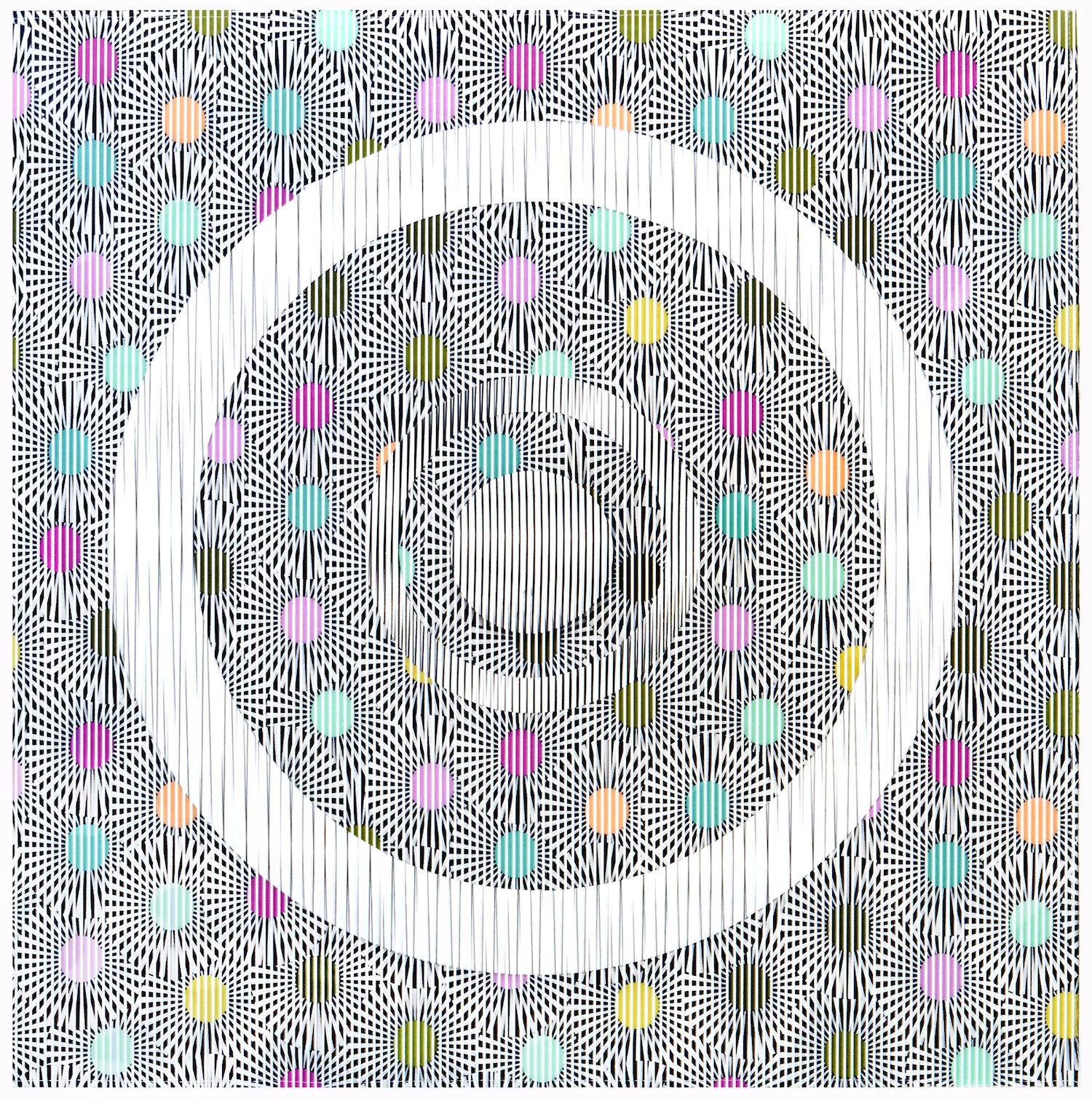
Day twenty-one: APRIL 22, 2020 ~ UNDERLying ORDER

Artwork details:
Artwork Title: Fire & Water
Artist: R. J. Oehler
Date: 2014
Dimensions: 22” x 19” framed
Medium: Yarn and beeswax on panel board
Price: $3,300.00 (click to purchase)

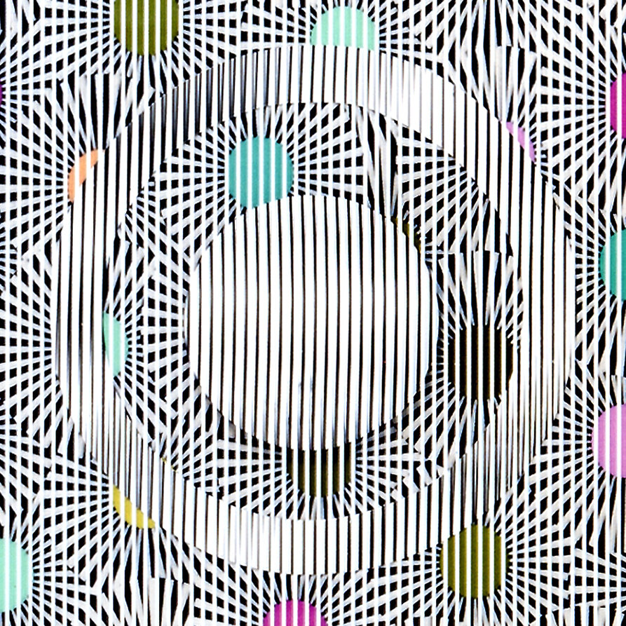
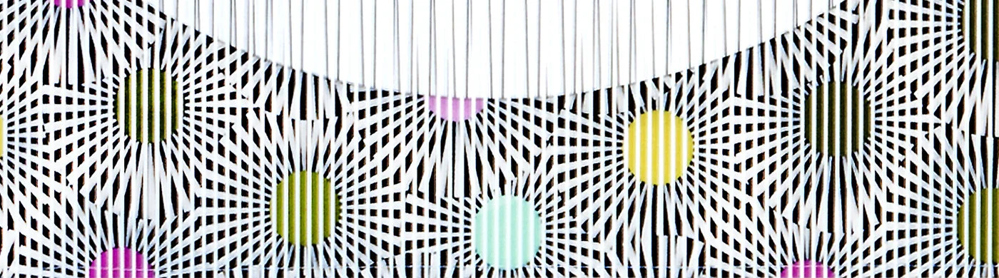
Detail of “Fire & Water” by RJ Oehler.
Influenced by a technique used by the indigenous Huichol people of Northwestern Mexico, R.J. Oehler renders his colorful forms by pressing dyed yarn into a beeswax-coated board.
In the past, Oehler’s works often dealt with the rhythm of plants and animals with an emphasis on pattern and story. Most recently, he has progressed from narrative-driven pieces to abstract, geometric paintings, taking inspiration from Islamic Geometric patterns. Rather than creating literal stories, Oehler finds excitement in experimenting with different forms. By using these materials, patterns, and techniques, Oehler continually deepens his own sense of color, rhythm and texture.

R. J. Oehler was born in 1950 in Newark, New Jersey. Very much an independent learner, RJ has no formal art education other than some “Life Drawing” classes. Instead, he has pursued a deeper understanding of art history and techniques through long hours of independent study in libraries, in museums and one on one with other contemporary artists. On this broad base of learning, he builds his own personal language using his varied life experiences and travels including time in Brazil in 1981. Ultimately, his practice grows the most when he is working alone in the studio or out in the landscape with his sketchbook.

Detail of “Fire and Water” by RJ Oehler.
Day twenty: APRIL 21, 2020 ~ cleansing

Artwork details:
Artwork Title: Rolling Rain
Artist: Michael W. Hall
Date: 2015
Dimensions: 25” x 19” framed
Medium: Gouache and watercolor on paper
Price: $950.00 (click to purchase)
Michael W. Hall is a self taught painter, muralist, woodworker, movie critic, dog walker, and freight train rider. He spends much of his time exploring less traveled paths, crisscrossing the US on back-roads and stealing rides on freight trains.
Michael's aesthetic is informed by his extensive backgrounds in screen-printing, graffiti, and psychedelic music. His inspiration is found hidden in shadows beneath bridges, squeezing through narrow holes in chain-link fences, and peeking from barely opened boxcar doors at a blurry country hurrying past.

A snap-shot of Michael W. Hall’s studio in 2015.
Michael’s work is always created by hand, painted without the use of tape or masking, allowing wobbles and imperfections to remain. It is important to him that while each piece is extremely precise, a close examination reveals the handmade nature of the process. Imperfetions are left to be discovered, the hand of the artist is revealed.
His clients include Facebook, Austin City Limits Music Festival, Nordstrom’s, the City of Smithville Texas, Austin Daily Press, Blackfeather Vintage, Batch Craft Beers, Beautiful World Syndicate Records, East Side Glass, and others.
He has exhibited in New York City, Philadelphia, Seattle, Austin, Dallas, and other cities throughout the US. He was one half of the experimental music duo and printing project, Ospreys, touring extensively from 2005-2009. He has written about his experiences riding freight trains over the last 18 years for Faded Glory magazine, and for the French book about North American boxcar art, Outside the Box. In 1999, he co-founded the Lost Film Fest, a nomadic film festival which continues to travel the world to this day.
Michael was born and raised in Baltimore, MD and lived in Philadelphia, PA for thirteen years before relocating to Texas in 2012.

In Michael’s own words:
I am entranced by ideas of travel and of sneaking into hidden worlds.
Much of my abstract work is inspired by the feelings I have while hiding in the shadows beneath bridges, sitting unseen behind bushes, waking up on a stopped train to discover I don't know what state I'm in.
I work predominantly in watercolor and gouache, as well as latex paint for mural work.
A detail of Michael W. Hall’s “Rolling Rain”.
Day NINEteen: APRIL 20, 2020 ~ welcome

Artwork details:
Artwork Title: untitled
Artist: Gleider Rodriguez
Date: 2016
Dimensions: 13.75” x 9.75” (16” x 12” framed)
Medium: Mixed media on paper
Price: SOLD

Detail of untitled work by Gleider Rodriguez.
Gleider Rodriguez is a young emerging artist living and working in Havana Cuba. When we first met him in 2016, he was still in high-school and was part of the Projecto Cintio Vitier. Now he has ventured off on his own and continues to follow his passion for the visual arts, creating emotional abstract paintings.
Projecto Cintio Vitier was established in 2009 in the Nuevo Vedado neighborhood of Havana Cuba by well-known visual artist Pedro Miguel González Pulido. Named after famed Cuban poet, essayist, and novelist Cintio Vitier (1921 – 2009), the Project initially gathered children and young adults from the diverse communities of the Consejos 53, 68, 18, around the uses of visual arts as a way to heighten their ethical and aesthetic values. Soon after it was founded, the Project began to offer painting, music, dance, photography, cinema, literature and dramatic writing workshops. The collaborative nature of the Project and its fostering of various artistic formats and techniques have helped to build a sense of community among the young Cuban artists. In turn, they have been able to collectively imagine and take action toward improving the cultural life of their neighborhoods and country.

Havana Cuba, 2017
The high-school age students at Projecto Cintio Vitier presenting an exhibit for us. Gleider Rodriguez is 2nd from the left in front.
We find it especially fascinating and refreshing that as maestro Pedro Pulido founded and oversaw the project, he allowed the youth to create using whatever style and medium they preferred; he did not dictating his own style of medium preferences on them. Every time we return to Havana, we make sure to stop by the Projecto Cintio Vitier to see what the students are up to. If they know we are coming in advance, they unusually mount a exhibit of their latest works just for us.

Detail of untitled work by Gleider Rodriguez.
Day eighteen: APRIL 19, 2020 ~ exposed

Artwork details:
Artwork Title: Madona Italiana
Artist: Diana Fernández
Date: 2012
Dimensions: 5.5” x 3” x 14” with base
Medium: Marble
Price: SOLD

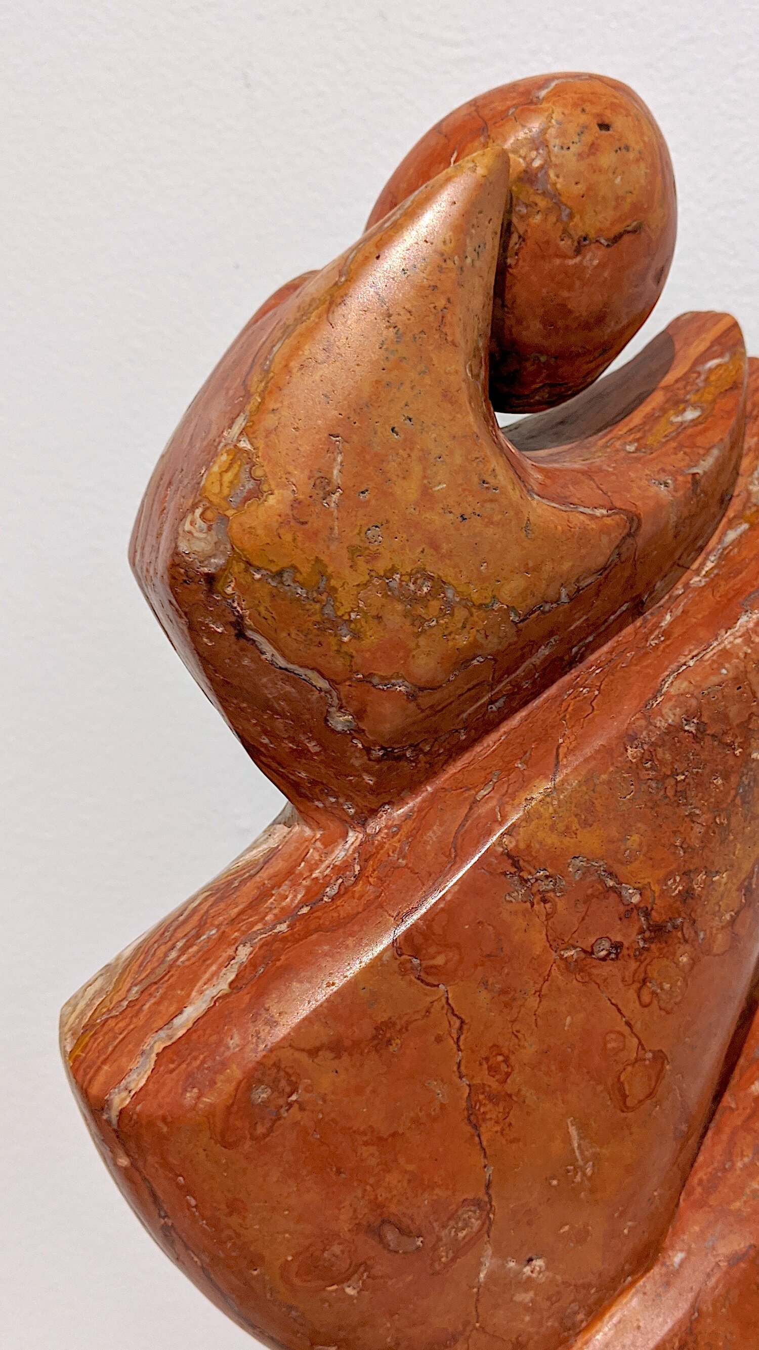
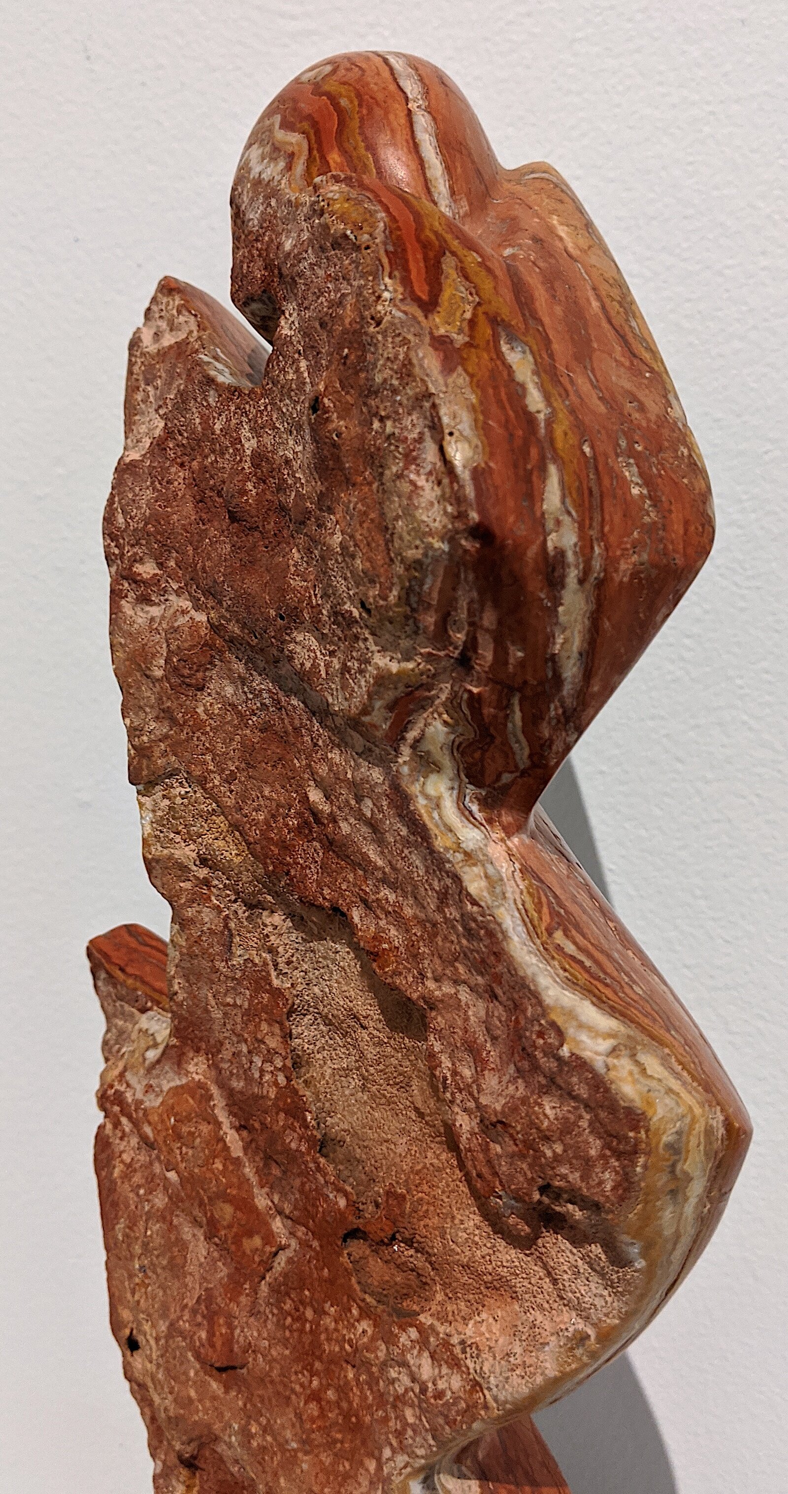
~ smooth on one side ~ rough on the other ~
Surely there is some implication to be concluded here…
One of our favorite things about this perfectly worked sculpture by Guatemalan master-carver Diana Fernández is the transition from the smoothly carved side to the rough rustic natural side.
It is like the perfect yin/yang.
Unfortunately the camera doesn’t pick up the sparkle from the exposed crystal minerals in the marble that you see on the rough side as you move around the art.

rough side view of “Madona Italiana” by Diana Fernández
With a Bachelor of Arts from the National School of Plastic Arts, Diana Fernández began her sculpture studies at the Cabrera Atelier with the sculptor Arturo Tala García. She also studied sculpture in Paris France and Archeology at the Universidad del Valle de Guatemala.
Diana has participated in over 275 national and international group exhibitions and 19 solo shows. Her artwork is part of important art collections in Europe and America.
Her artworks have won numerous international awards including Milan International Art Award (Milan, Italy), Goya International Award, 2017 Barcelona Biennial (Barcelona, Spain), and Artist of the Year 2012 from the Rosas Botran Foundation.

detail of “Madona Italiana” by Diana Fernández
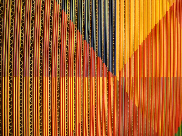
Day seventeen: APRIL 18, 2020 ~ glowing horizon

Artwork details:
Artwork Title: Chromatic Interference #2
Artist: Edward Lane McCartney
Date: 2014
Dimensions: 24” x 48”
Medium: Cardboard, paper, wood, & aluminum
Price: $7,500.00 (click to purchase)

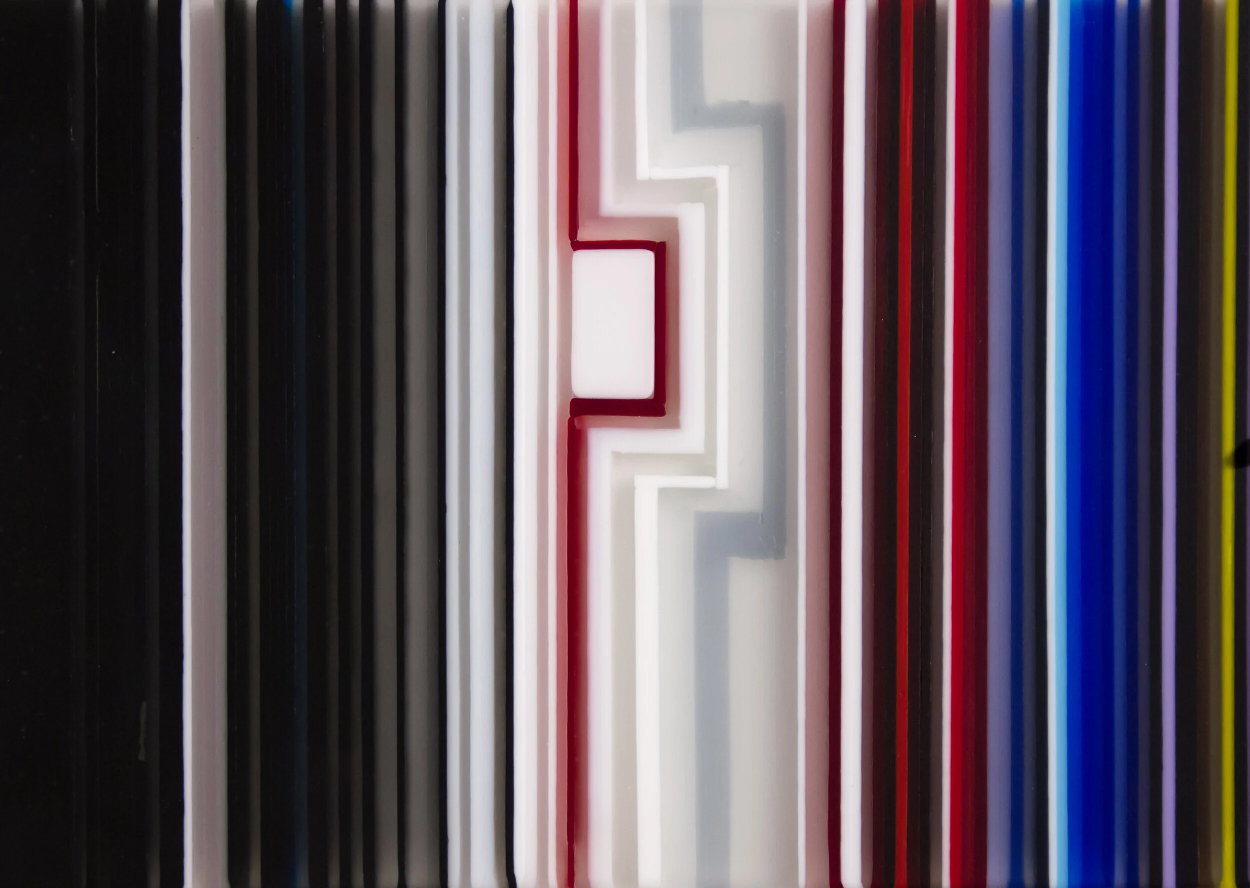
detail view from the side of “Chromatic Interference #2” by Edward Lane McCartney
The post on day ten of this exhibit featured another one of Edward’s artworks from his Chromatic Interference series. In that post, we explore the ideas behind the Chromatic Interference series and also include an artist statement. If you are interested in reading that information, please scroll down to day ten.
We want to keep this particular post simple and let Chromatic Interference #2 speak for itself.
The only commentary we are adding is to point out the difference in how Edward treats the cardboard elements in this Chromatic Interference #2 verses the cardboard in Chromatic Interference #16.
The edge of the cardboard here is rendered rough and installed so that it protrudes out past the cut paper; while in Chromatic Interference #16 the cardboard is cut with super precision and set flush with the cut paper. Notice how this change gives the artworks such very different feelings, especially when viewed from an angle.
For us, Chromatic Interference #2 has a much softer visual feel – almost like a tapestry or fabric.
What do you think?
Spend some time looking deeply at this piece: What do you see? How do you feel?

detail view from the side of “Chromatic Interference #2” by Edward Lane McCartney
Day sixteen: APRIL 17, 2020 ~ rush of anticipation

Artwork details:
Artwork Title: Threshold: Onion Creek Metropolitan Park
Artist: Valerie Fowler
Date: 2019
Dimensions: 24” x 24”
Medium: Oil on wood panel
Price: $2,500.00 (click to purchase)

detail of Valerie Fowler’s “Threshold: Onion Creek Metropolitan Park"
When I was a young boy growing up in Houston, I was lucky enough to spend many weekends at my grandparents home in the country, just East of Central Texas, or West of East Texas, or North of South Texas – a threshold of Texas – if you grew up in Texas, you’ll know what I mean. Anyway, every weekend was an adventure. After helping with chores around the house or garden or yard, I’d be released to explore. I remember the feeling of standing on the edge of my grandparents acreage, where the mowed lawn ended and the wild things began – peering off into the lush tangle of woods, mind spinning with anticipation, heart racing with excitement – just before diving in to see what there was to see – oh that feeling – Threshold: Onion Creek Metropolitan Park reminds me of that feeling and those moments.
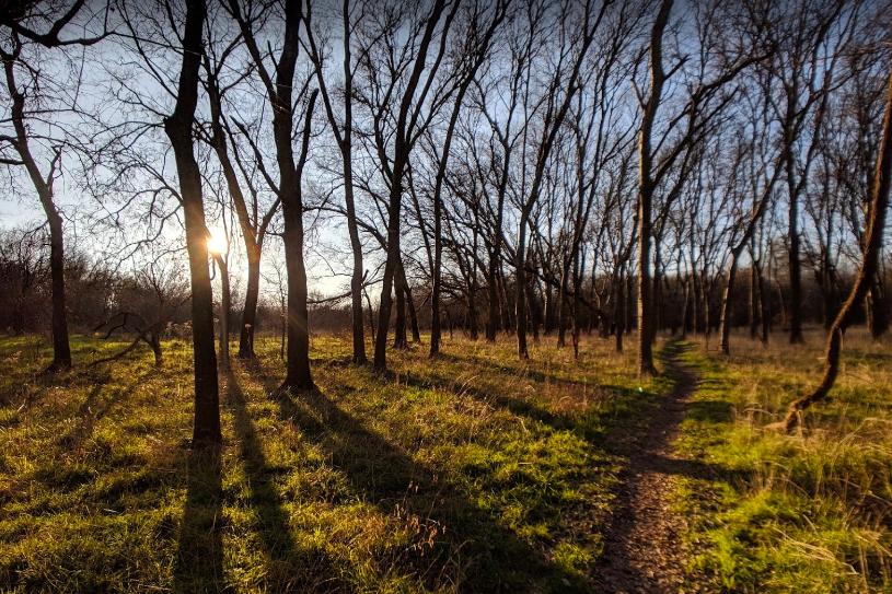
This photo of Onion Creek Metropolitan Park in Austin Texas was culled from the internet.
And it is no wonder why, Valerie Fowler has since explained to me that this artwork was inspired by the Onion Creek Metropolitan Park, an area the city of Austin plans to develop, but as of now, exists in a combination of very wild spaces and somewhat manicured suburban spaces – the threshold between what is wild in nature, and what humans overlay onto it.
“My artworks portray settings or scenes illustrating states of nature on earth. Through implied narratives I relay my concern and love for our fragile home as I explore the mark we humans make on it. Stories, taken from my own interactions with nature, are integral. Over time I’ve developed personal touchstones and archetypes sourced from my native Texas environment, which hint at allegories. I endeavor to communicate themes examining the qualities of beauty in nature, and also, our common mortality. ”

detail of Valerie Fowler’s “Threshold: Onion Creek Metropolitan Park"
Valerie Fowler grew up in Houston. Her father was noted Houston sculptor, Bob Fowler (1931- 2010). After graduating from U.T. (with a B.A. in Art) she made Austin her home and has been actively involved in art making and art exhibition for over 30 years. Nature is her chosen subject. Her complex and intricate oil paintings and drawings describe a natural world of extreme beauty and vigor while also conveying nature’s sensitive vulnerability.
Valerie has painted murals for Whole Foods Market in Austin, Chicago and Ann Arbor; she has provided illustration and layout work for The Texas Observer; and illustrationed CD jackets for local musicians. One of her most notable visual/musical collaboration projects is a fully illustrated 64-page book that accompanies the CD for "Ivy and the Wicker Suitcase", a musical project written, recorded and produced by her husband Brian Beattie. The "Ivy" project toured the East and West coasts and she and Beattie produced the full stage production for Austin's Stateside at the Paramount Theater in 2014. In 2016, Fowler held Nature and Other Stories at Austin’s Dougherty Arts Center, a solo exhibit and mid career retrospective, with artworks spanning 2 decades.
Most recently, the Texas Book Festival selected her as their 2018 Festival artist. Her painting: Spring, Everything Changes; Fredericksburg, Texas graced the festival poster and corresponding campaign materials. Fowler teaches art in her home studio and is also an art instructor at The Contemporary, The Art School at Laguna Gloria. Fowler has exhibited widely in Austin and throughout Texas and is collected nationally. Both she and her husband maintain studios adjacent to their South Austin home. She paints, draws or gardens daily.

detail of Valerie Fowler’s “Threshold: Onion Creek Metropolitan Park"
Day fifteen: APRIL 16, 2020 ~ gaining perspective
What is your perspective on this piece? How does this artwork make you feel? Is it a vista? Is it an Object? Are you looking out or are you looking in? Are you looking through something or at something?
Artwork details:
Artwork Title: Alluring View
Artist: Rachel Kalisky
Date: 2018
Dimensions: 17” x 14”
Medium: Kiln-formed glass
Price: $2,600.00 (click to purchase)
Artwork conceptualization in Rachel’s studio for the creation of Alluring View.
Earlier in the exhibit, we talked about the fused glass process and Rachel’s use of it - so scroll down to Day Two if you’d like to know more about the material and process.
Alluring View is an example of Rachel’s flat glasswork - to be hung vertically, on the wall, as a space divider, or in front of a window or light. This work is tactile – it is meant to be touched – the surface is smooth, but not flat - there are waves where the glass is thicker, then thinner – where bubbles may have formed.
Rachel Kalisky has mastered the Kiln-forming and Fused Glass process to the extent that she can actually place and keep air-bubbles in the corners of her rectangular patterns - this is a signature artistic element in many of her artworks and is on clear display in Alluring View.
detail of “Alluring View” by Rachel Kalisky
A little about Rachel:
In her previous career as a designer, Rachel Kalisky was known for her contemporary interiors, straight lines, bold colors and her willingness to tackle any design challenge. In 2004 she attended a fusing workshop and immediately became intrigued with the medium and decided to pursue this new direction in glass. Working with renowned glass artists, she attending Red Deer College, in Alberta, Canada, Pilchuck Glass School in Washington and continued her studies with courses, workshops and most recently in 2016 an invited residency in North Lands Creative in Scotland.
Rachel became a finalist in the E-merge glass 2004 and the First Texas Juried Glass competition, receiving the Jurors Award of Merit. She became a finalist in the 2006 Niche Award and a finalist again in the 2007 Texas Juried Glass II competition. She was included in the book E-merge Showcase of Rising Talents in Kiln-glass and has been included in multiple magazine and newspaper profiles and articles.
In the last 16 years, Rachel Kalisky’s artwork has been exhibited in cities around the country, including in Austin (TX), Corpus Christi (TX), Delray Beach (FL), Dallas (TX), Galveston (TX), Michigan City (IN), Philadelphia (PA), Pittsburgh (PA), Portland (OR), and Taos (NM). These exhibits include numerous prestigious museums and galleries including Cornell Museum of Art in Florida, Art Museum of South Texas, and the National Liberty Museum in Philadelphia. A native of Canada, she now lives and works in Austin, Texas.
detail of “Alluring View” by Rachel Kalisky
Day fourteen: APRIL 15, 2020 ~ strength revealed
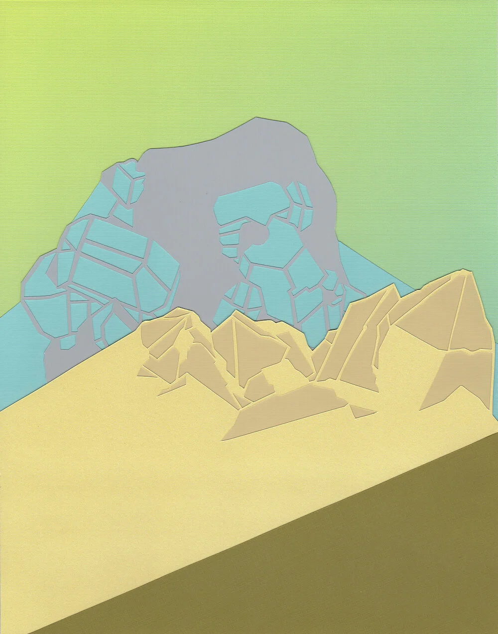
Artwork details:
Artwork Title: Dawn 1
Artist: Rebecca Rothfus Harrell
Date: 2016
Dimensions: 15” x 12” framed
Medium: Hand cut paper
Price: $450.00 (click to purchase)
“I am intrigued by the variations in form, color and complexity that make naturally occurring formations feel as though they are engineered objects.”

A view of Rebecca’s pristine work space with some of her inspirations visible.
Intrigued and inspired by the works of the American Precisionist of the 1920’s and 30’s such as Peter Blume and Charles Demuth, Harrell adopts their approaches of dimensional simplification, time flattening, and selective realism, applying them in her own way to the organic geological environment of her imagination. The resulting spaces fight the landscape label yet conjure up feelings of otherworldly terrain.
Rebecca utilizes mineral structures as the primary source imagery in her artwork. The goal of mineralogy is to identify, define, and classify minerals. Scientific illustrations describe the angles and planes that distinctly define the form of a particular mineral. Rebecca’s goal is to de-contextualize those same forms by manipulating their scale, flattening the surfaces and revealing lines or planes that are not naturally visible.
The majority of Rebecca’s work falls into two material categories: either intricate and precisely hand cut paper collages (of which Dawn 1 is an example of), or graphite and paint (usually gouache or flash paint) on paper.
Rebecca creates works in all scales, from small 6” x 6” works on paper to larger-than-life size exterior wall murals.

detail of “Dawn 1” by Rebecca Rothfus Harrell
An Abbreviated Bio:
Rebecca Rothfus Harrell earned a BFA from The School of the Art Institute of Chicago, and a Master of Arts in Teaching from The School of the Museum of Fine Arts/Tufts University.
She has completed several residencies including at The Banff Center in Alberta, Canada in 2015 and The Helene Wurlitzer Foundation in Taos, New Mexico in 2019.
Her art has been exhibited around the country, including in: San Jose, CA; Telluride, CO; Miami, FL; Chicago, IL; Columbus, OH; Philadelphia, PA; Dallas, TX; Marfa, TX; and Austin, TX.
Additionally, in 2018 Rebecca was commissioned by Kendra Scott to create custom artwork for the launch of her candle collection, and also in 2018, Facebook commissioned her to install a mural in their Dallas headquarters.
Living in Austin Texas, Rebecca works as both a full time studio artist and a part time arts educator.

detail of “Dawn 1” by Rebecca Rothfus Harrell
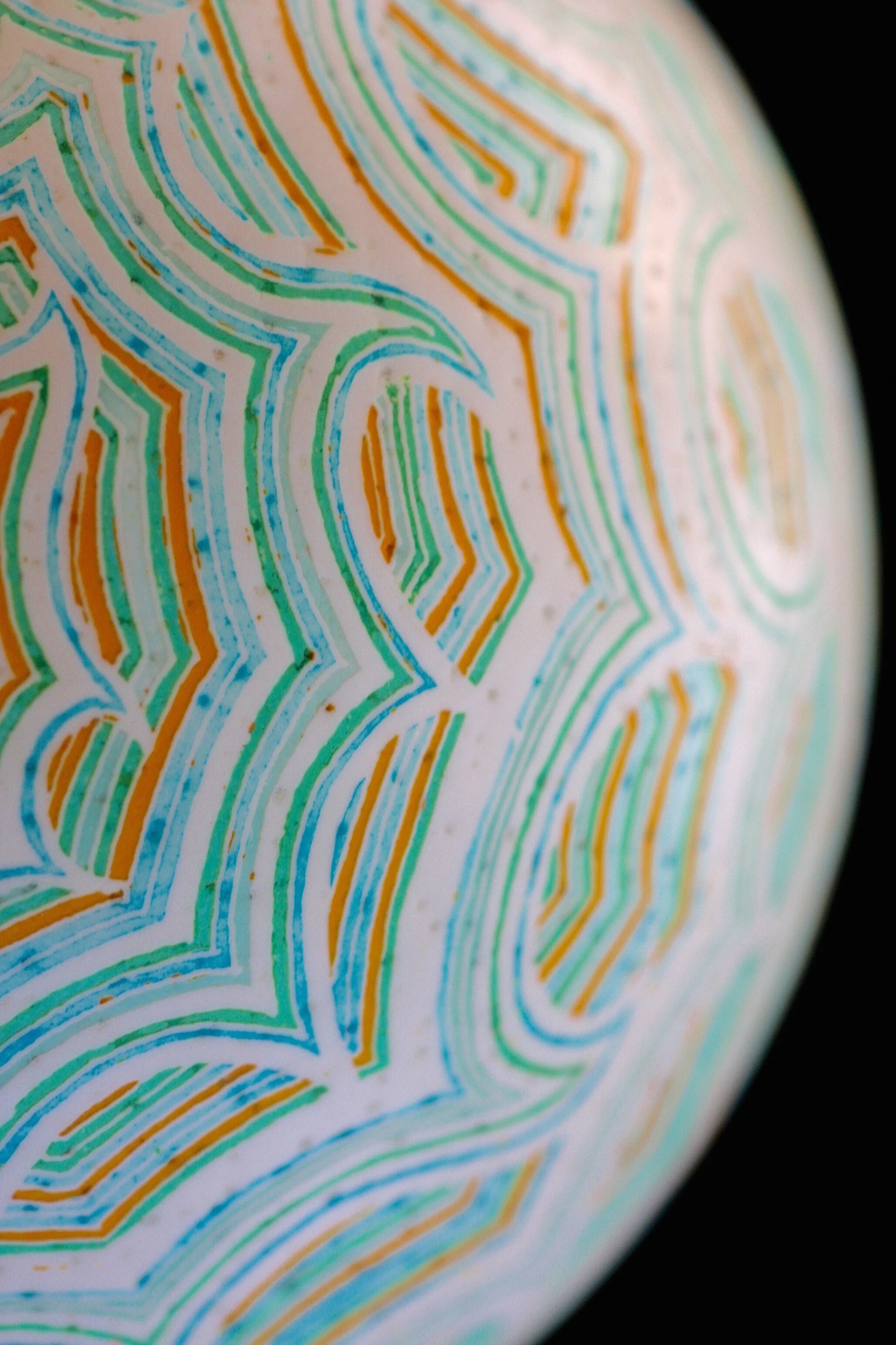
Day thirteen: APRIL 14, 2020 ~ jovial dance
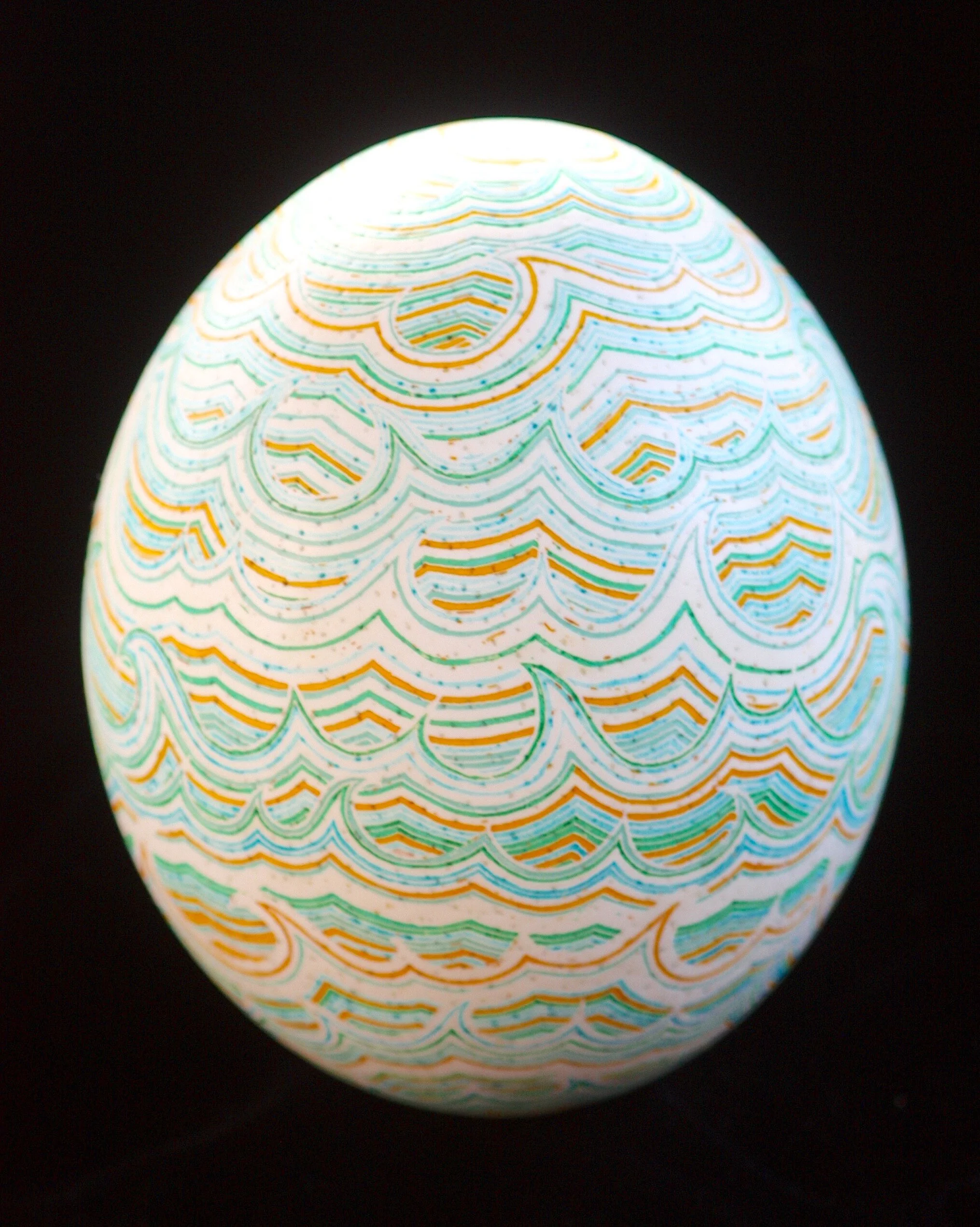
Artwork details:
Artwork Title: Gamboling Water
Artist: Katy David
Date: 2016
Dimensions: 11.25” x 5” x 5”
Medium: Etched and Aniline dyed Ostrich Eggshell with varnish on wood stand
Price: $1,250.00 (click to purchase)
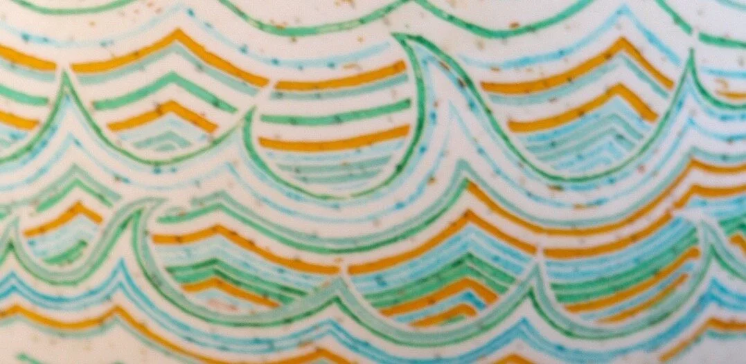
detail image of “Gamboling Water” by Katy David
In Gamboling Water, Katy’s mark-making and layering of colors enhances the graceful curves, the delicate natural coloration, and the luminous yet stone like feel of the eggshell. From every angle, this artwork seems to come to life, to be caught in mid-motion – nature’s jovial carefree ongoing dance.
In Katy’s
Own Words:
I create artworks that ask the viewers to participate by imagining themselves immersed in a conjured landscape of color, line and texture. I explore how meaning can emerge from pattern, using color as a guidepost. Detail and repetition are important facets of my artistic practice. The imperfection of the handmade is integral because even when I strive to repeat patterns or designs, inevitably differences emerge that are inherent in creation. Each is the same; each is different. This creates an interesting dichotomy and a compelling viewing experience, one that invites deeper study of the artwork both as a physical object and as a representation of the importance of each individual as a part of the whole.
A native of Austin, Katy David first established a following of patrons with her uniquely modern presentation of a centuries-old technique called Pysanky. In this batik process she uses beeswax, a small heated funnel, and aniline dyes to create intricately layered patterns of color, geometry and two- dimensional lines on three-dimensional eggshells. Gamboling Water is from this body of work.
Over the last few years she has incorporated new mediums and methods into her artistic practice, now creating fired ceramics and gouache paintings. Even though these two new mediums diverge visually and materially from her earlier work, a closer look reveals her continued fascination with line, pattern, and movement.
detail image of “Gamboling Water” by Katy David
Day twelve: APRIL 13, 2020 ~ luminous
Artwork details:
Artwork Title: The Portal Closes
Artist: Misha Penton
Date: 2018
Dimensions: 24” x 24”
Medium: Acrylic on canvas
Price: $1,200.00 (click to purchase)
“My work resounds in expressionistic landscapes where elemental energies of wild places converge. The physicality of paint on canvas allows me a space to experience and share nature’s dynamic, ever changing color worlds. I work with the poetics of movement, intuition, improvisation and play, and with a committed practice of awareness and a sensitivity to the unfolding creative process, which itself crafts and reveals meaning.”
“The Portal Closes” was included in Liminal & Luminous, Misha Penton’s second solo exhibit with CAMIBAart Gallery. All of the visual works for this exhibit consist of rich shimmering colors and expressive movement creating an emotionally contemplative environment. At the same time, the accompanying sound world Misha created for Liminal & Luminous is an ambient and immersive voice-scape in which Misha uses of multi-layered voice tones, whispers, and phrase fragments to mirror the introspective nature of her visual art work.
Click below to play the soundscape here so you can listen to it while enjoying the art and reading the rest of this post. >>>>>>
“Luminous: full of or shedding light; bright or shining, especially in the dark”
The Portal Closes (right) with her sister piece, The Portal Opens (left) at the exhibit “Liminal & Luminous”
detail of “The Portal Closes” by Misha Penton
About the Artist:
Misha Penton is a contemporary opera singer, artistic director, media artist, librettist and lyricist. Her work explores the intersection of new music performance; new opera theater; soundscape composition; and bel canto and extended vocal techniques. She is the founder, artistic director, and ensemble lead artist of Divergence Vocal Theater, a Houston-based opera, new music and multi-performing arts ensemble. Professional affiliations include Houston Grand Opera, Museum of Fine Arts Houston, Menil Collection Houston, Dallas Museum of Art, The Foundation for Modern Music, The University of Houston Center for Creative Work, the Jewish Community Center Houston, Liminal Space Contemporary Music Ensemble, and DiverseWorks Arts Space Houston.
Her visual artworks have been shown throughout the Southeast, and are included in private collections in Houston, Austin, Fort Lauderdale, New York City, and New Orleans; her large-scale work, untitled 2 was included as a winner of Lawndale Art Center's The Big Show (2004).
Misha is a part-time doctoral candidate in music at Bath Spa University, UK. She holds a BA in Music from Skidmore College and an MFA in Interdisciplinary Arts from Goddard College. Even though she has plane-hopped quite a bit from Beijing to Brunei and Bangkok to Berlin, and though she officially splits her time between Houston and the UK, she is most in love with isolated wild places like Vancouver Island, Isle of Skye, and The Orkney Islands.
To learn more about Misha’s Universe, visit her spectacular website here.
detail of “The Portal Closes” by Misha Penton
Day eleven: APRIL 12, 2020 ~ Jubilant
Artwork details:
Artwork Title: Tree Dynamics #128
Artist: Orna Feinstein
Date: 2016
Dimensions: 23” x 23” Framed
Medium: Monoprint on collaged paper with fabric and printed plexiglas
Price: $2,800.00 (click to purchase)
center detail of Orna Feinstein’s “Tree Dynamics #128”
Orna is inspired and fascinated by the interior geometry of the organic, the concentric patterns of tree rings, the linear patterns of wood grain, and the cellular structure of a plant. Over the past 20 plus years she has explored these fascinations using a wide variety of materials and methods, most notable are her mono-print based artworks.
Here, Tree Dynamics #128 is created using layers of printed Plexiglas, mono-printed papers, and patterned fabrics. The colors and patterns create a lively effect, further enhanced with movement of the viewer. Because of the moiré patterns, Tree Dynamics #128 has a spinning starburst effect that makes the artwork feel jubilant and celebratory.

Sample of the moire pattern in “Tree Dynamics #128”
detail of Orna Feinstein’s “Tree Dynamics #128” - look closely and you’ll see how the fabric is sewn to the paper
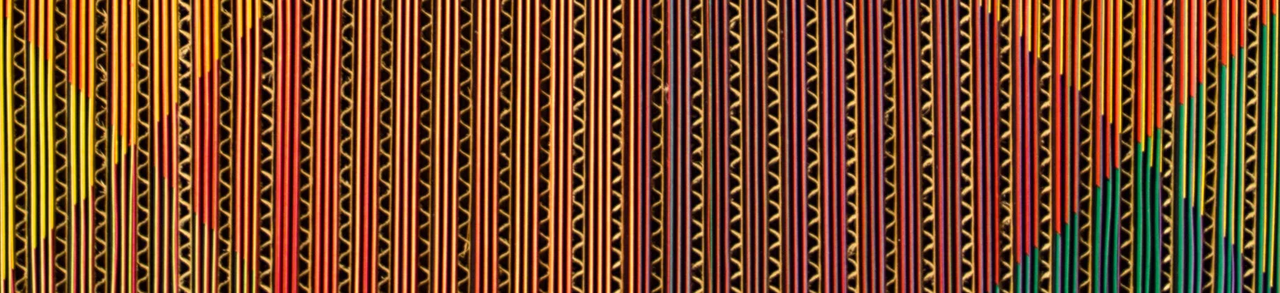
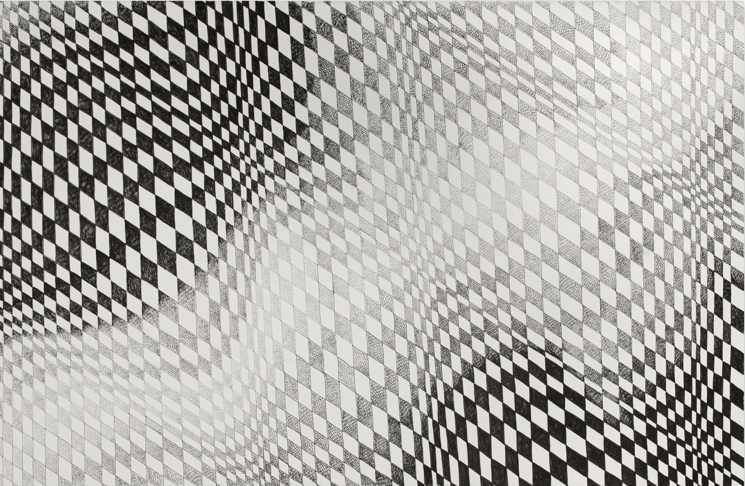
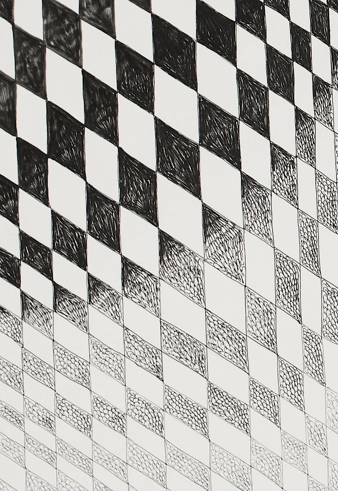
Day ten: APRIL 11, 2020 ~ rhythm & harmony
Artwork details:
Artwork Title: Chromatic Interference #16
Artist: Edward Lane McCartney
Date: 2016
Dimensions: 22” x 22”
Medium: Cardboard, paper, wood, & Aluminum
Price: $2,500.00 (click to purchase)
Edward Lane McCartney is a true creative; living a creative life – made to create – driven to create. Given this drive and ability, one might expect, and would be correct in assuming, that McCartney has a broad visual and creative aesthetic. There are however many common threads among all of his creations, not least of which is his propensity to build his artwork. Even his most two-dimensional art can be seen as built works. Using his craftsman’s hand, and his attention to detail, he creates artwork in a wide range of scales; from large wall works to miniature wearables – in all using their materiality and movement to evoke a sense of play.
With Chromatic Interference #16 we find a non-representational geometric abstract artwork that deals very specifically with visual runs of color, creating rhythm and harmony.
As the viewer moves around the artwork and the rhythmic pattern of the materials are unveiled, the playfulness of the artwork becomes apparent. This self-guided rhythm is engaging, absorptive, and hypnotic. We get lost in the song and beauty. We forget the commonality of the artwork’s materiality.
Chromatic Interference #16 was part of the exhibit Edward Lane McCartney: Chromatic Fantasy, a complement of color.
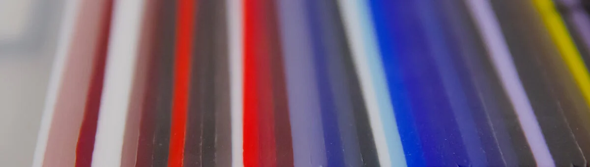
detail of “Chromatic Interference #16” by McCartney
In the artist’s own words:
When I was 16 the first musical composition I ever penned was a Fantaisie Chromatique. I had been attempting to play one by J. S. Bach and I was fascinated by the half tone runs, that with performance velocity, almost a glissando effect could be achieved, a blending of the most proximate of notes struck on the piano. With the Chromatic series of works, the frequency of tone has been supplanted by the frequency of color and light.
I have been interested for some years in works that are visually kinetic, the perception of reality, of experience, and the transformation of accessible media. In the proximity of small bits of color placed adjacent to one another the viewer perceives colors that only exist in his or her own reality. While moving past in physical space, these artworks become mutable and colors and tones are distinguished, emphasizing the their lack of stasis. They exist multi-dimensionally transmuting in time and space in an ever-changing environment of movement and light.
detail of “Chromatic Interference #16” by McCartney
Day Nine: APRIL 10, 2020 ~ listening
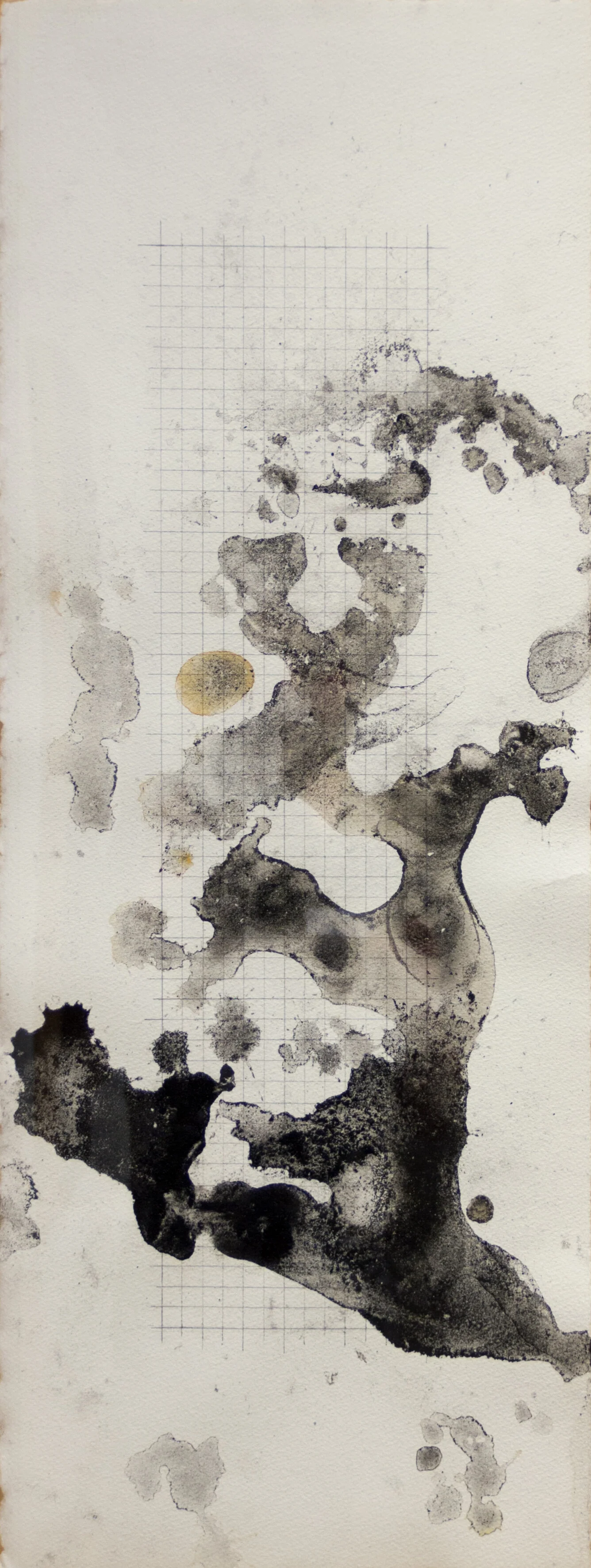
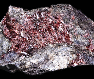
“Through my artwork I am searching for new ways to value coal. We often appreciate the earth’s natural resources for their economic value, but what if we look beyond that? What if we were to appreciate coal for the way it reflects light? Or the way it sounds when water runs through it?”
Artwork details:
Artwork Title: Powder (erosion drawing)
Artist: William T. Carson
Date: 2017
Dimensions: 35 5/8"” x 16 5/8"” framed
Medium: Coal and graphite on paper
Price: $750.00 (click to purchase)
Over the years, William has developed several processes using Coal as his material to create different series of artworks. In one series he calls “coal paintings”, he creates three dimensional sculptural wall works using broken, crushed, and ground coal mixed with an adhesive. “Powder” is from another series of work he calls “Erosion Drawings”. Below William shares some of his thoughts on the Erosion Drawings and Sculptures:
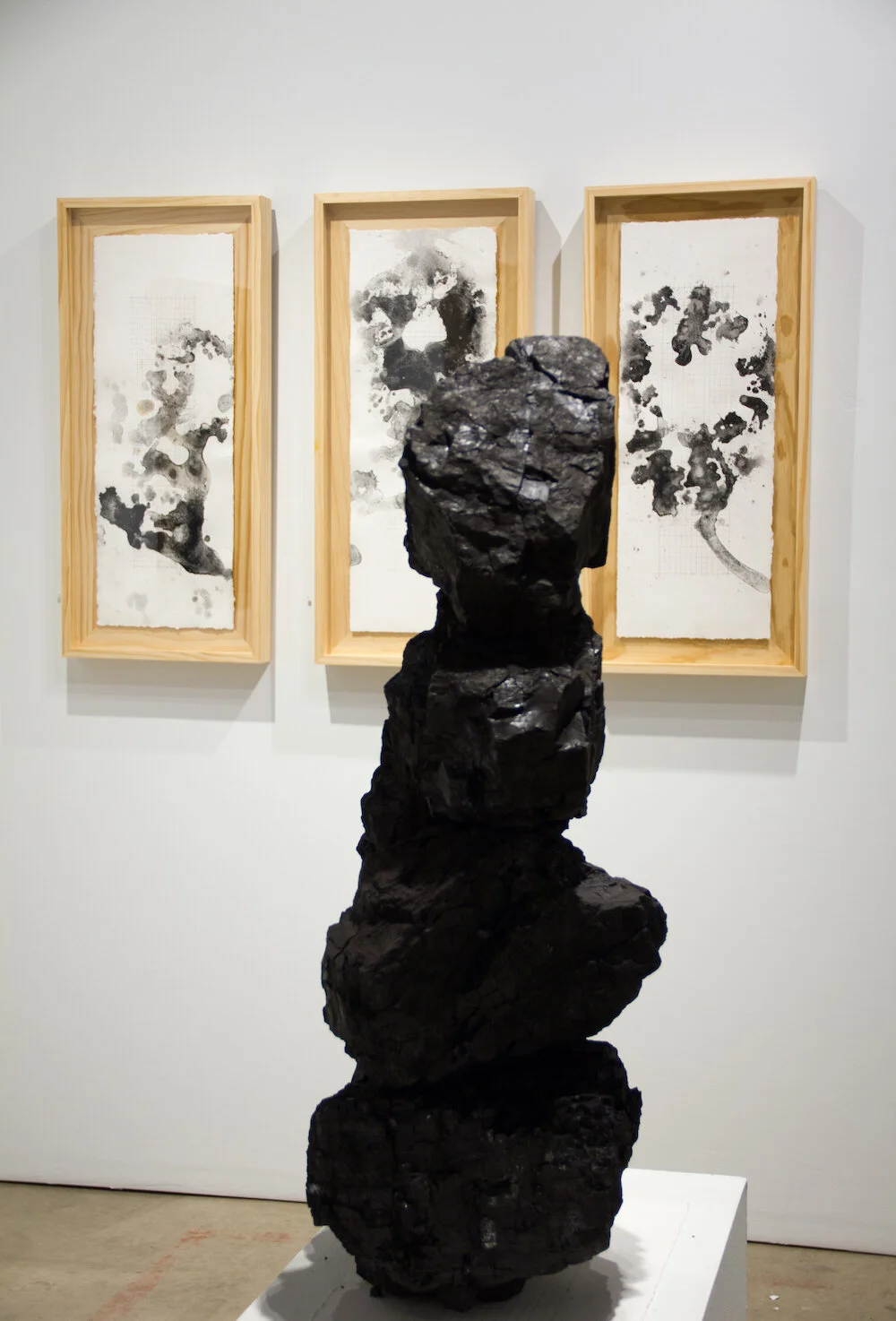
Photo by David D. Bailie of William T. Carson’s 2017 exhibit Unearth
Large boulders of bituminous coal are used to create the sculptures in this exhibition. They are made by balancing the stones one atop the other. I enjoy balancing the stones. The forms resemble cairns, which can be found as trail markers and waypoints all over the globe. Cairns are an example of a benevolent relationship that humans can have with stones, so I find them to be a fitting form for the work I am making with coal. These sculptures are simply about presenting the raw material as a stack of stones in hopes of providing an opportunity to observe coal’s aesthetic characteristics.
Erosion drawings are made by dripping water onto the coal sculptures and letting the water flow through the stones. As the water travels through the large boulders of coal, it creates a subtle crackling sound that I find to be meditative. The water erodes small particulates and picks up coal dust as it travels downward. Once the paper catches the runoff and the water evaporates, we are left with a coal dust stain that can be seen as a portrait of the coal. This process is a chance for the coal to speak for itself and make its own mark.
Each interaction with the material teaches me something new and I feel there is much to learn from coal.

Short video clip from William T. Carson's 2017 exhibit - Unearthed of an Erosion drawing being created through a community interactive installation.
In 2017 CAMIBAart Gallery presented the William T. Carson: Unearth exhibit. As part of this exhibit, William created a coal sculpture in the gallery and allowed visitors to interact with the sculpture by pouring water onto it. This was informally offered daily as guests visited the gallery and also offered more formally in three guided “artist talk/performances”.
As the water flows through the coal, it creates a crackling sound – it can be a meditative, almost spiritual experience. Included here is a short video clip of one of the guided erosion drawing performances.
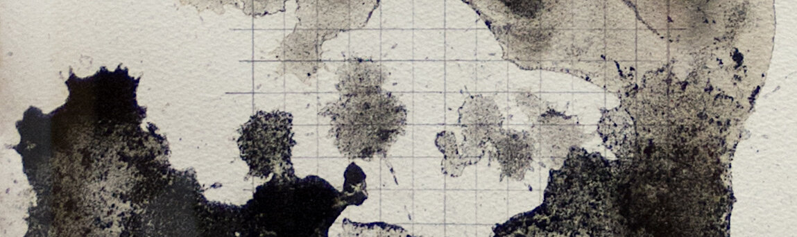
detail of “Powder” by William T. Carson
Day eight: APRIL 09, 2020 ~ passage
Artwork Title: Flight Plan, Migratory Birds
Artist: Lorena Morales
Date: 2015
Dimensions: 30” x 40” framed
Medium: India Ink on paper
Price: $2,600.00 (click to purchase)
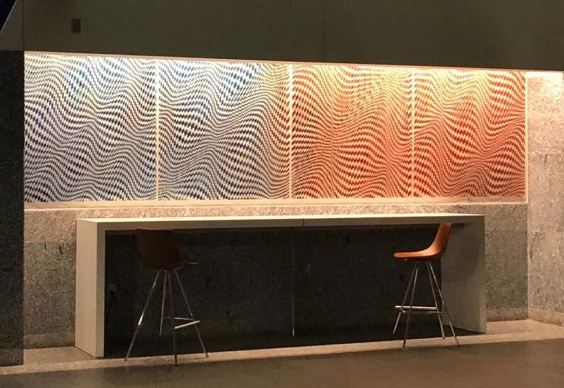
Photo of commissioned “Flight Plan” installed at the George R Brown Convention Center in Houston, Texas.
Look closely at “Flight Plan, Migratory Birds” and you see this ink on paper artwork is a practice in mark-making. And although the material choice may seem unusual for Lorena, who is known for her work on translucent surfaces, it makes more sense when you realize this work is actually a precursor and concept development for a much larger commissioned project, Flight Plan, installed at the George R. Brown Convention Center in Houston. Commissioned by Houston First Corporation, the convention center piece is a large-scale installation created using enamel paint on four 50” square Plexiglas panels.
detail of “Flight Plan, Migratory Birds”
Artist Statement
Art has always been relevant in my life; however, it was in 2003 when I moved to Houston from Venezuela that I believe my art practice became grounded. Even though, or maybe especially because, over time my perception of home has changed, all of my artworks now relate to the journey of finding my way home. Recollections of familiar sounds, everyday scents and reoccurring images, from both my birth home and my adoptive home, become abstract as they interweave within me and bubble to the surface in my mind. Through the use of vivid colors and geometric shapes over transparent surfaces, my works propose a visual passage evoking memories, emotions, and expectations.
About the artist
A native of Venezuela, Lorena Morales graduated from Rafael Urdaneta University with a degree in Business Administration before immigrating to the United States and studying at the Glassell School of Art at the Museum of Fine Arts, Houston. In 2011, she was awarded scholarships from The Carlos Cruz-Diez Foundation and the Glassell School to participate in the Advance Seminar in Contemporary Art: The Doors of Perception.
Lorena Morales’ artworks have been exhibited in Germany, Venezuela, and throughout the US, including extensively in Texas. Winning many awards and grants, she has also completed numerous public and private commissions. For two years in a row, her works have been selected to be part of a Houston billboard campaign to celebrate Latino artist. This project is organized, juried, and sponsored by Inter-University Program for Latino Research, UH Center for Mexican American Studies, and Clear Channel Outdoor.
detail of “Flight Plan, Migratory Birds”
Day seven: APRIL 08, 2020 ~ beauty in darkness
“As with all my monochromes, the paintings help us remember the beauty in darkness and that without darkness in some degree, a painting runs the risk of being only pretty, not beautiful. ”
Artwork details:
Artwork Title: Black Forest Landscape
Artist: Richard Cole
Date: 2019
Dimensions: 15” x 30”
Medium: Oil on panel
Price: $1,000.00 (click to purchase)
detail of “Black Forest Landscape”
About Richard & his Artwork:
Bringing his attention to detail and his contemplative nature into his studio practice, Richard creates emotive paintings that are hard to define; they live somewhere between surrealism, hyper-realism, and pure abstraction.
With a background in both business and creative writing, Richard has published three books including a Memoir and a book of poetry. In addition, he is the recipient of numerous accolades including the National Endowment for the Arts Literature Fellowship, Minnesota State Arts Grant, and the Bush Artist Fellowship. His paintings are often described as ethereal, contemplative, and evocative.
Richard wrote the follow in reference to his formal education in painting:
I worked with the older painters,
union men and slow as Christmas
but their style was perfection,
laying down a thick coat of enamel
over intricate moldings, frame and trim
with long, seamless strokes. No brush-marks, no drips. They never used tape, not even for windows.
“Better a good brush and a steady hand.”
They taught me attention and care,
cleaning and double cleaning the bristles
in solvent, then water and soap, then wash again. All winter we detailed a white mansion overlooking a snow-covered lake.
The owner was head of HR for Giant Seeds,
a family man, and he spent the season with his wife
in a Florida splashed with green.
The house was empty, just me and the three men
in white, painting white, disappearing into our work
on schedule, and we finished the day before
he returned, gathering our brushes, buckets and drop cloths, leaving nothing behind, spotless, calm, as if we were never there.
~ Richard Cole
Richard’s Artist Statement:
I’ve always been attracted to how a painting can define boundaries that it cheerfully oversteps, the way a paraphrase can help explain a poem but never fully exhaust its meaning. I look for gradient understandings, a contemplative reach built on logic but never confined to logical statements. I think that any successful painting has an inner life, with thoughts left unspoken even though their depth and weight might feel obvious to the viewer.
I've found that truth is paradox by its nature - both/and rather than either/or - with each side of anything interpenetrated by the other. This understanding has played out in my life as I’ve worked in corporate America while supporting a parallel career in poetry and painting. My paintings often illustrate my writing, and my writing is centered on images, and everything is tinged by how I make my living. The themes of work, faith, prayer, spirituality and art are intertwined to reflect a sacramental view of the world.
Influences include Heraclitus’ thoughts about a world of flux and fire, Taoism, an incarnational understanding of Catholicism, the plasma-filled paintings of Van Gogh and Monet, Rothko, and the Outsider Art of the American South.
detail of “Black Forest Landscape”
Day six: APRIL 07, 2020 ~ Balance
Artwork details:
Artwork Title: The Rosette of Justice
Artist: Zoë Shulman
Date: 2017
Dimensions: 11” x 12.75”
Medium: Digital painting and mixed media printed on aluminum
Price: $385.00 (click to purchase)
Justice (as defined by Merriam Webster Dictionary)
~ the quality of being just, impartial, or fair
~ conformity to truth, fact, or reason

detail of “The Rosette of Justice”
About the Artwork:
The Rosette of Justice is from Zoë Shulman’s 2018 exhibit “The Allegory of Good and Bad Government”. In this exhibition, twenty hexagon shaped artworks were displayed in pairs where they presented a vision of America’s democratic republic as both morally introspective and politically active.
Zoë Shulman translated the fundamental allegoric structure of Ambrogio Lorenzetti’s medieval frescos by the same name, “The Allegory of Good and Bad Government”, into a system of geometric symbolism, conveying a moral American government. Informed by cross-cultural symbols, biblical themes, and the ancient philosophy of alchemy, this geometric symbolism resonated with humanity’s timeless aspirations and fears.
You can find more information and photos from the exhibit on our website here.
For those that want a really deep dive into the process and thoughts behind the exhibition and the artworks, you can download the Essay written by Zoë Shulman for the exhibit catalog by clicking HERE. This essay is for personal download only. Contact us for any other printing and use permissions.
About the Artist:
Zoë Shulman earned a Bachelor of Fine Art in Painting and Drawing from Minneapolis College of Art and Design in 2013. Since graduation she has exhibited works in a variety of galleries, museums and universities nationally and internationally. Notable exhibitions include “The 2017 Biennial: Origins in Geometry” at the Museum of Geometric and MADI Art in Dallas, “The 2014 Minnesota Biennial” at the Minnesota Museum of American Art in St. Paul, and "The 20th Anniversary Alumni Exhibition" at the Burren College of Art in Ireland. Her artwork is also included in the permanent collection of the Museum of Geometric and MADI Art in Dallas.
Zoë has completed artist residencies at Starry Night Retreat in New Mexico, The Banff Centre in Banff Canada, The Vermont Studio Center, and Kleindorf Art in Germany. She currently lives and works in Austin Texas.
detail of “The Rosette of Justice”
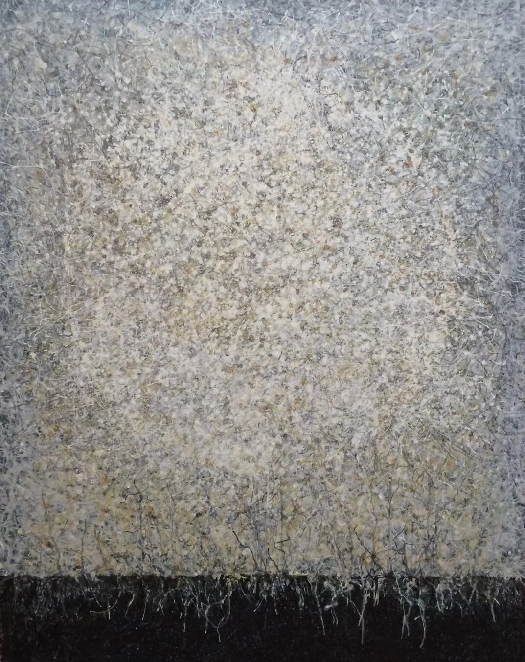
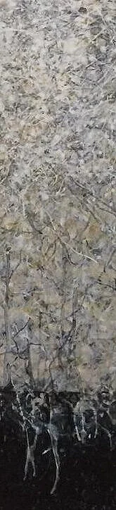
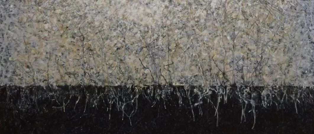
Day five: APRIL 06, 2020 ~ renew
Artwork details:
Artwork Title: Renew
Artist: Charlotte Smith
Date: 1994
Dimensions: 60” x 48”
Medium: Acrylic on canvas
Price: $9,000.00 (click to purchase)
This rare work of art was created by Charlotte very early in her career. For today’s post, we’d like to let the art speak for itself; so no detailed stories about its meaning or how it was made.
Please take a moment … expand the image as large as your monitor will let you … breath deep … and … really … really … spend time with it.
Here are some words that come to mind for us:
strength
energy
inner glow
centering
roots / rooted
grounded
core
warmth
What comes to mind for you? ~ How does it make you feel? ~ What do you see? ~ We think Charlotte gave it the perfect name – RENEW.
Day four: APRIL 05, 2020 ~ HARMONY
Artwork details:
Artwork Title: The Singer Child
Artist: Edgardo Kerlegand
Date: 2018
Dimensions: 54” x 43”
Medium: Acrylic on canvas
Price: $5,400.00 (click to purchase)
About the Artist
Edgardo Kerlegand’s studio in San Miguel de Allende, Mexico
Edgardo Kerlegand was born in 1964 in the Southern state of Chiapas. From an early age he showed interest in painting and specifically the human figure. From 1985 to 1995 he studied at the National School of Plastic Arts (FAC UNAM) where he spent his time with teachers and fellow classmates discussing composition and symbolism in figure images. His early influences were Impressionism, Expressionism, and Mexican Muralism. However, in 2001 while sequestered with a group of Hagiographer monks in Athos Greece for a year, he found his path to freedom through the practice of both contemplation and active meditation. Now his artworks are as much about self-expression, contemplation, and reflection as they are about the image of the subject.
Over the years his artworks have been exhibited around the world including: Argentina, Bosnia, Colombia, Croatia, Ecuador, Guatemala, Panama, Spain, United States, Yugoslavia, and of course throughout Mexico. Since 2006 Edgardo has been actively drawing, painting, and teaching in San Miguel de Allende.
Occasionally, when our CAMIBAart Tours visit San Miguel de Allende, Edgardo will graciously welcome our guests into his home studio.
Story behind“The Singer Child”
Five years ago Edgardo began a mural project at an Orphanage. The children of the orphanage are subjects in the mural. There are 58 faces on the walls and “The Singer Child” is one of those faces.
Detail of “The Singer Child”
Some of Edgardo’s Influences include:
Asian Painting, Orthodox Iconography, German Expressionism and Mexican Muralism.
Some of Edgardo’s Sources of Inspiration are:
Rembrandt, Gustave Doré, Peter Paul Rubens, Francisco Corzas, Francisco Toledo, Johann Sebastian Bach, Orhan Pamuk, Jean Loup Sieff, Andrei Tarkovsky, Ferzan Öspetek, Fernando Pessoa, Emil Cioran, Confucius, and Plato.
Detail of “The Singer Child”
Day three: APRIL 04, 2020 ~ Calming and lyrical
detail of Bluestem #13
Artwork details:
Artwork Title: Bluestem #13
Artist: Lee Albert Hill
Date: 2013
Dimensions: 36” x 48”
Medium: Acrylic with cold wax finish on canvas over panel
Price: $3,600.00 (click to purchase)
About the artist ~ Lee Albert Hill:
The work of Texas-based painter Lee Albert Hill follows a strictly process driven formal vision, devoid of pictorial motifs and narratives.
Lee Albert Hill’s signature technique begins with informal mood-setting background layers, often including organic mater and textures, and then combining a foreground of rigorous hard-edged mark-making of geometric lines and flourishes.
Born in Garland, TX in 1963 Hill received his 5-Year Professional degree in Architecture from Texas Tech University in 1986. In addition to his painting practice, he has been a member of the American Institute of Architects and a registered practicing architect since 1991. Hill’s work can be found in private and public collections such as Loews Hotels in New York City, Marriott Corporation in Dallas, Texas, and Austin Texas based Developers Riverside Resources, and SAMTX Investments.
About the process:
Bluestem is a native prairie grass and can be found across the North Texas region where Hill's home and studio are located. Works in the series are produced in several steps. Bluestem is carefully selected for its potential to create impressions in acrylic paint on canvas while exposed to the weather. After weathering, the works are then brought into his studio where forms and patterns are discovered, taped off and painted over. Through a process of adding and subtracting, an under-and-over-painting is created. The result is a unique visual language of contrasting patterns which express reductive forms and space.
But as we all know, rules are made to be broken, and this artwork “Bluestem #13” is a rule breaker. Even though it is titled “Bluestem”, it is one of three works that Lee did in the middle of this series in which he didn’t actually use the Bluestem process to create his background. Instead, he aimed for a more painterly and lyrical feel and experimented with a softer brushed effect. In the end, the visual softness is exactly what created the calming effect that we responded to so well, and what made this piece perfect for this virtual exhibit.

Bluestem #13 horizontal detail
Day two: APRIL 03, 2020 ~ dramatic truth

Artwork details:
Artwork Title: True Colors Redux
Artist: Rachel Kalisky
Date: 2019
Dimensions: 8.25” x 7”d
Medium: Kiln-formed glass, cut, assembled, hot-formed, blown, cold-worked, sandblasted
Price: SOLD
Rachel first created this flat panel of glass before hot-forming, blowing, cold-working and rolling up to create the final vessel “True Colors Redux”
Rachel’s primary form of creative expression is glasswork – specifically kiln-formed fused glass. Our feature piece for today started life out as a flat fused glass panel that Rachel created in the Kiln. Then she used the Roll-up method to turn it into the beautiful round vessel you see here. For those not familiar with kiln-forming or roll-up processes, see the detailed side bar below.

Glass Basics
Glass Fusing is the process in which colors of glass are bonded together through heat in a kiln.
Kiln-forming is the process of shaping glass in a kiln with heat and gravity.
The Roll-Up method usually starts with a Kiln-formed or Fused-Glass panel and through the repeated process of heating and “rolling”, the panel is given shape.
Depending on the skill of the artist, these shapes can range from simple bowls to complex vessels and sculptures.
For those that want to dive deeper, here are some quick resources:
Rachel doesn’t always have a statement that goes with her artworks, but this piece is special in that way. Originally created for an invitational exhibit about Truth, this is Rachel’s statement about the artwork:
The essence of art is truth – the truth artists see and what they want you to see. I used white in the center of my piece because it is the purest of colors and truth is pure, honest and authentic. The red encasing the white reflects the energy and passion in my life and my work. Neutral tones and blues suggest safety, dependability trust and commitment. They anchor the work, just as truth provides an anchor in our lives. Calming purples suggest unexpected endings -- the element of surprise -- and truth can sometimes be surprising. It can also be illuminating and energizing, like the sunlight suggested by the yellow accents here. I use black in most of my work because it is powerful, magical and mysterious. It is also basic, fundamental and enduring – like truth itself. ~ Rachel Kalisky
Day one: APRIL 02, 2020 ~ Warmth & wisdom

Artwork details:

Artist Tahila Mintz at work developing the image
Artwork Title: Embrace
Artist: Tahila Corwin Mintz
Date: 2016
Dimensions: 49” x 39” unframed
Medium: Silver Halide Photographic Print (unique)
Price: $2,100.00 (click to purchase)
We are starting off the exhibit with this particular work of art because we feel it is what we all need right now – a big embrace – full of warmth and wisdom.
This black and white portrait comes from the exhibit “Spoken” by Tahlia Mintz. The scale of the photo, the angle the photo is taken from, and Mintz’s mastery of the “dodging and burning” process during development, creates a work that has a sense of life and movement. We are amazed at how enveloping this work feels.

A detail crop of “Embrace” by Tahila Corwin Mintz
About Tahila Corwin Mintz:

A detail crop of “Embrace” by Tahila Corwin Mintz
Tahila C. Mintz is a Yaqui photographer, film maker and new media artist who has worked around the world to foster cultural understanding through these mediums.
Currently, the short film “Mi’kmaw’s foolish notions of suffrage” by Tahila C. Mintz is exhibited in The MAC’s new media gallery. In this film, Jane Meader discusses the Mi’kmaw creation story and how this relates to the venerated place of women in their culture. The empowering story provides different ways of understanding gender roles.
Jamut is the Yaqui word for Woman. In our language the reverence of honor, power, beauty and fortitude are inherent. When this word is translated into English this essence can be missing. - Tahila C. Mintz